The three pillars of strategic visual branding
Your logo, colour and typeface aren't decoration; they're strategic choices that must support your brand message. Bad visual branding makes you generic. Good visual branding makes you unforgettable.
That colour you chose for your brand? That probably wasn't strategy. It was a feeling, a preference or worse still; someone said that suits your brand well and Bob's your uncle. Many entrepreneurs see visual design as the icing on the cake. Nice to look at, but completely the wrong way of thinking.
Visual branding is a strategic weapon. It determines how customers recognise you, remember you and above all: trust you. Let's put right what so often goes wrong here.
Why entrepreneurs often get visual design wrong
Most startups begin here: they hire a designer who makes something pretty, and done. The mistake lies in what comes before. There's no strategy. There's no thinking about who you are, what you project and how you should translate that visually.
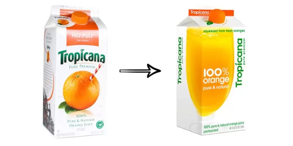
The Tropicana rebrand was one big failure
Tropicana removed their iconic orange from the packaging. Customers didn't recognise the carton anymore and left it on the shelf. This cost PepsiCo an estimated 50 million dollars. PepsiCo hastily reversed the design.
The lesson? You can't simply replace your brand identity with something more modern without strategy. Design without brand insight leads to disaster.
What is the relationship between strategy and visual design actually?
Here it comes: your visual identity must translate your brand strategy into something people see and feel. Nothing more, nothing less.
You have:
→ A brand strategy (who are you, what is your goal, which values?)
→ A tone of voice (how you speak to your customers)
→ A visual identity (how you look)
All three must be in sync with each other. If your brand is unconventional, creative and young, but your logo looks like a 60-plus law firm; then you have a problem.
If your brand story is about sustainability and impact, but your colours say cheap mass product; well you get the principle.
Visual design is therefore not something you delegate to a designer. That's something that emerges from your strategic choices. The designer works with you on translating, not on determining.
The three pillars of strategic visual branding
Your logo is your first impression
Your logo says in one second who you are. But many entrepreneurs choose a logo because it's pretty. Wrong approach. The approach should be: does this logo say something about what you do and who you are?
I see companies with distinctive brands (innovative, human, creative) who choose generic geometric shapes. Or companies that project stability and reliability, who choose messy and playful. Mismatch.
A stronger logo works in many formats, looks good on a website AND on a small business card, and says something about what you do.

The classic Yahoo logo.
Yahoo and MySpace: rebranding too late solves nothing either
Yahoo and MySpace waited years before they adapted their brand. When they finally took action (Yahoo in 2013, MySpace in 2010), they tried to solve their problems with just a new logo.
It didn't work. Yahoo was acquired in 2017 by Verizon for 4.5 billion (whilst Google was worth 120 billion). MySpace lost users en masse to Facebook.
The lesson? You can't solve problems that run much deeper with a logo strategy. And if you wait too long with repositioning, even the best design comes too late.
Colour is psychology
Here many entrepreneurs really go wrong. They choose a colour because they like it, not because that colour means something.
Blue feels trustworthy and professional. Red projects energy and urgency. Green says sustainability. Yellow is optimistic and friendly. Purple is luxury and creativity. This isn't coincidence; this is human psychology.
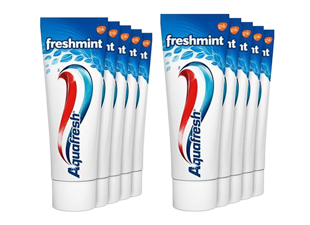
White, red and blue: these were for years the only three colours that Aquafresh used.
Aquafresh: why three colours clean better than one
Aquafresh had three colours on the tube for years: white (clean teeth), blue (fresh breath) and red (healthy gums). When they went to completely white? 74% of users found the original toothpaste worked better. Same formula. Different jacket.
Colour isn't just decoration; it communicates function. Remove those colours, and you remove the promise.
If you're an agency that sells creativity, and your whole branding is beige and grey; then you raise some questions. If you're a financial adviser and your whole colour palette is neon pink and bright green; then your customers are probably going to have doubts.
Choose your colours based on: what do your customers feel? What supports your brand personality? What distinguishes you from competitors?
Typography speaks too
Your typeface determines the atmosphere. Decorative, classic typefaces give something old and elegant. A tight, geometric typeface feels modern and business-like. Handwritten typefaces feel personal and warm.
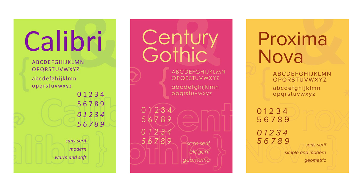
Actually two different fonts are enough for a brand. Plus possibly an extra font for social media for example.
The mistake entrepreneurs make; they choose more than three typefaces because variety is nice. Result; chaos. Your brand feels unprofessional and messy.
Choose your typefaces consciously. One for headings (can be somewhat more characterful), one for body text (must be very readable). That's usually enough.
How you approach visual branding strategically
Strategy first, then design. This is the golden rule.
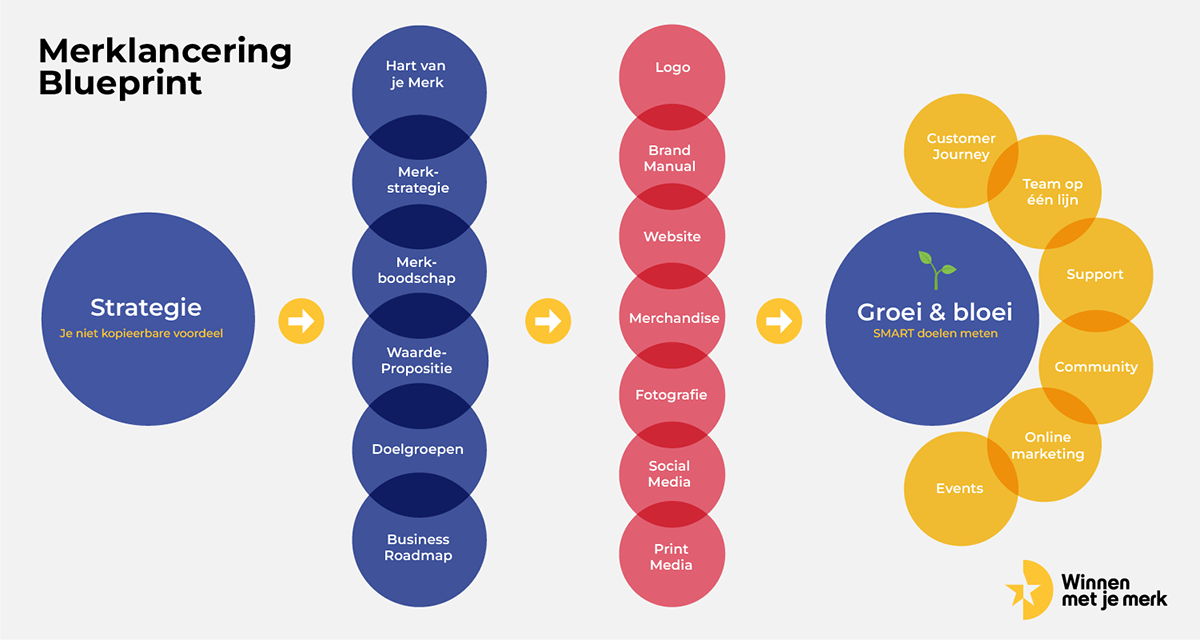
In the training Build an Irresistible Brand I coach the course participants intensively on strategy (strategy first). That's your best starting point.
Step 1
Define your brand strategy. Who are you, what is your goal, which values drive you?
Step 2
Determine your personality. Are you serious or playful, classic or modern, minimalist or lavish?
Step 3
Work with a designer who understands your strategy. Not a designer who says leave it to me. But a designer who asks questions and translates your strategic choices.
Step 4
Ensure that your logo, colour and typography all tell the same story.
Step 5
Remain consistent. This isn't a one-off choice; this determines how your customers see you, year in year out.
Clients like BenefitStudio and ClubJoy go through exactly this journey: strategy first, only then design. With visual branding that says something.
The difference between pretty design and strategic design
Pretty design wins awards. Strategic design wins customers.
Pretty design can be arbitrary. Strategic design is purposeful. Pretty design adapts to the trends of this moment. Strategic design remains relevant, because it's based on something deeper than trend.
Your competitors probably also have a pretty logo. But do they do it strategically? Probably not.
This is your chance to enter differently than 90 per cent of your competitors. Not because you're prettier, but because you're more deliberate.
Finally
Your visual identity isn't decoration. It's not something you add on once your website is already finished. It's the language with which your brand speaks before you've even said anything.
Treat it as strategy, not as beauty. Work on it before you start communicating. Ensure it remains consistent. And above all; ensure it actually says something.
Your brand deserves better than arbitrarily beautiful colours and arbitrarily beautiful shapes. Visual branding is just one pillar of a strong brand identity. Want to know more about how to build a complete brand identity? Discover here how to go from zero to one.