Logo design: generated or genuinely made?
You want a new logo design. Something that makes your brand visible, that people remember, that works in every environment. But where do you start? There are so many rules, so many 'do's and dont's on the internet. Let me tell you this. Most logos fail not because they're badly designed, but because they have no message. They're generated, not made. In this blog I'll take you through four fundamental principles that will make your logo genuinely essential rather than a throwaway version.
Summary of this post
A strong logo design communicates your brand message without words; it's relevant to who you are and what you do; it contains that one hidden detail that people don't forget; it's technically perfectly made, so it shines everywhere; and it works in every shape and format. These are the four pillars on which genuine brand identity stands.
A good logo communicates without words.
Here's the thing: your logo doesn't need to be obvious. It doesn't need to literally say what your company does. Take the Amazon logo; at first glance you see a smiley. Look closely, and you see an arrow from A to Z. That arrow? It tells your story. It says: 'We have everything you're looking for.'
That's communication at a higher level. Your logo is your silent ambassador. It works like a secret handshake; people recognise you instantly in a flash, without you having to say a word.
At Fitbrand (my other company) we applied this principle last year for an e-commerce business. Their logo started as some lines and colours that said nothing. We revisited it and asked: what do we actually want to convey? Trust? Speed? Growth? As soon as that became clear, the logo transformed. Suddenly there was meaning. Suddenly customers not only recognise the logo, but also feel what the company stands for.
How do you ensure your logo says something?
Think of the logo as the answer to a question. What are you? What do you offer? What do you stand for? The logo must give that answer without anyone having to ask. Coca-Cola doesn't say 'soft drink'. That cursive script says 'classic, reliable, for everyone'. Nike's swoosh doesn't say 'sports shoes'; it says 'movement, drive, achievement'.
Your logo must do the same. It must capture your brand essence in form and colour.
A good logo is relevant to who you are
Many companies (and designers too for that matter), want to project something with a brand that's really cool. They want to come across as trendy. So they reach for whatever's hip at the moment. That leads to logos that feel like generated images from DesignEvo; generic, impersonal. As if they're all the same everywhere.
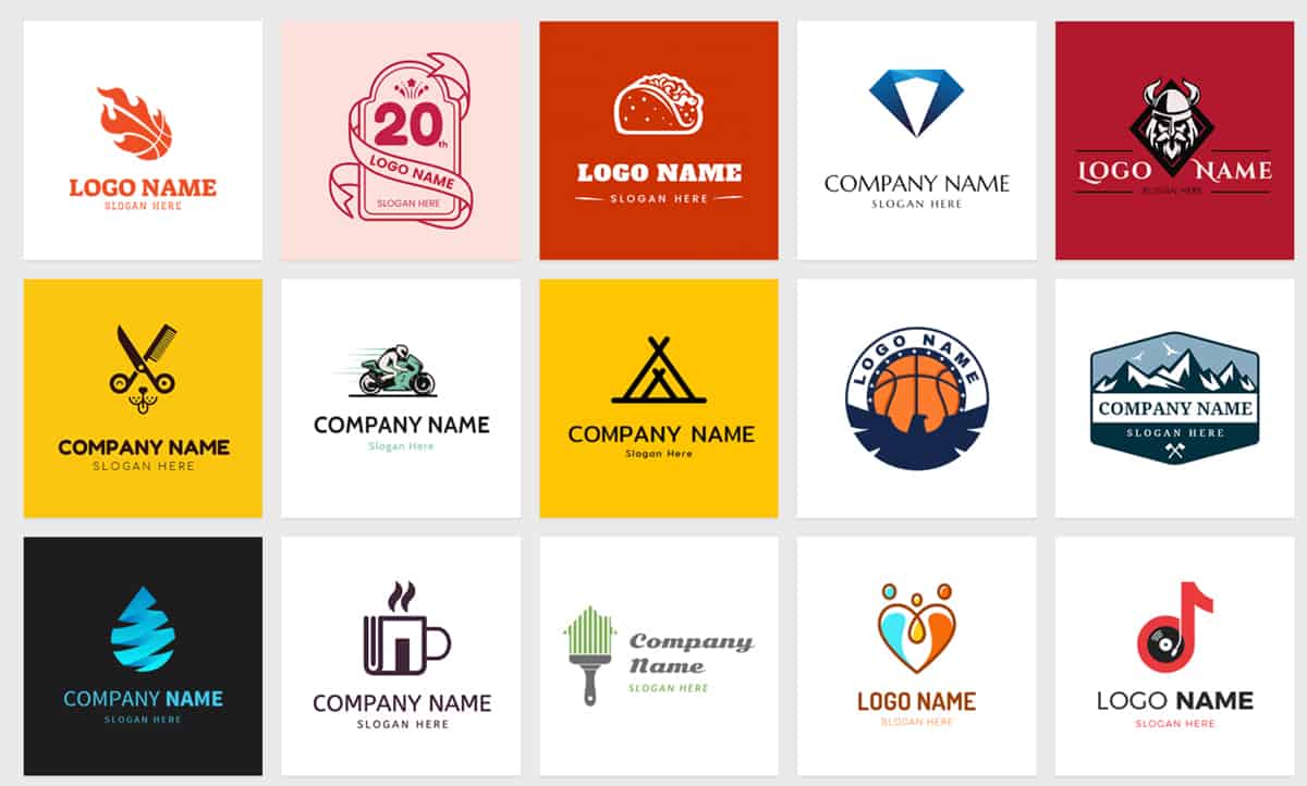
DesignEvo: A free logo in no time. Generic, impersonal and directionless.
Relevance means that your logo feels like your brand. It fits who you are, not who you'd like to be.
A coach working in personal growth chooses a minimalist logo, because that's 'modern'. But her brand personality is actually: warm, accessible and human. Then you get a disconnect between the logo and the brand personality. The visual identity then gives the opposite signal to what she's communicating.
Why relevance is worth more than trendy
Ask yourself these questions:
→ What are my core values as a brand?
→ Who is my ideal customer and what do they value?
→ What feeling should my logo evoke when someone sees it?
→ Does this design fit those answers?
If you answer 'no' to that last question, then it's not relevant. Then it's beautiful in itself, but not your logo.
At Fitbrand we always consider this. We don't design in a vacuum. We first dive into the strategy, into who the client is, what the brand is worth. Only then do we pick up the pen. That makes the difference between a logo that's okay and a logo that genuinely represents your brand.
A good logo is memorable and remains relevant.
This is where timing comes together. Your logo must stand out from the crowd, but that can't be by being weird. It must have that one brilliant twist that ensures it sticks. And at the same time it must feel timeless, not stuck in today's trend.
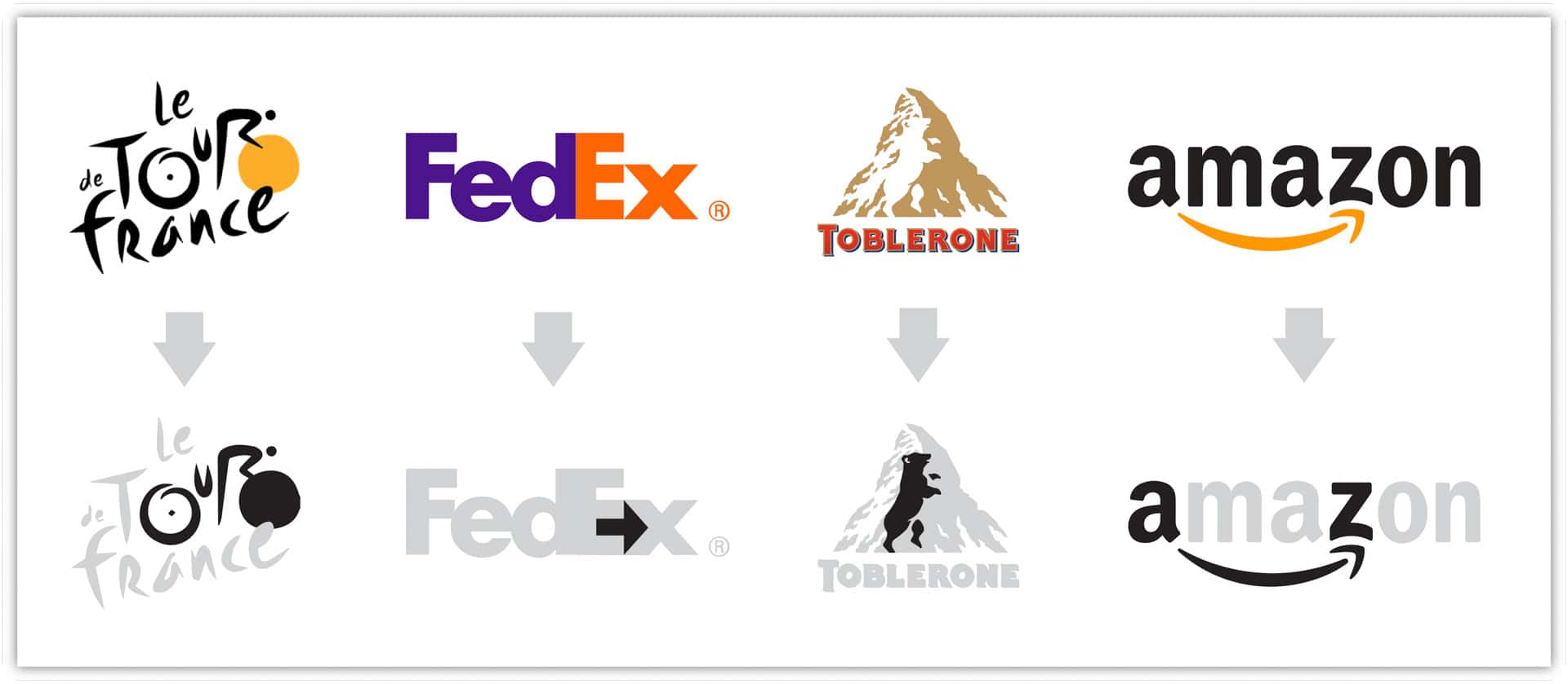
The hidden messages in the logos of 4 major brands,
Think of the FedEx logo. It's simple. You see it, you think: 'Yes, just a logo.' But if you look more closely? That hidden arrow between the F and X. Suddenly your brain sees that pattern and you can't help but smile. That's the secret. That little surprise. That easter egg waiting to be discovered.
We apply the same philosophy to everything we design. A hidden detail. A subtle element that customers discover when they look more closely. That makes a logo unforgettable.
How do you prevent your logo becoming dated?
Leave trendy designs aside. That polygon art from 2015? It already feels heavily outdated. Halftone effects? That trend is long behind us. What remains standing? Simplicity. Strong concepts. Something that works just as well in ten years as it does today.
Apple's logo. An apple with a bite out of it. Nothing more. Made in 1977. Still working hard. Why? Because it doesn't depend on techniques or trends. It's pure concept.
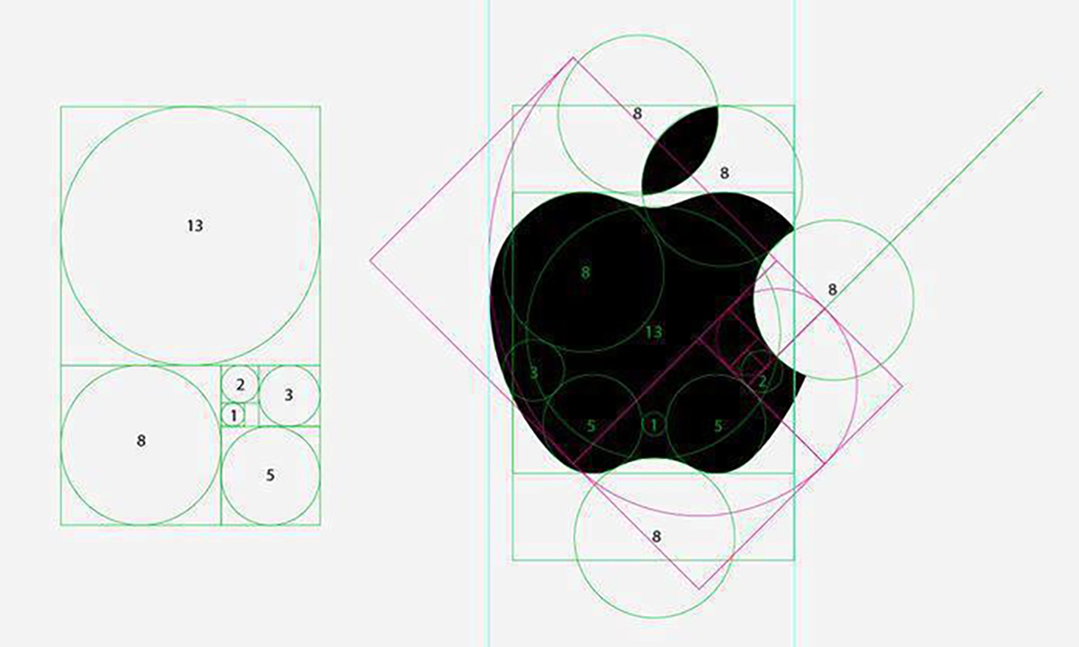
Technical perfection in the Apple logo.
So; don't choose what's hot now. Choose what's true.
A good logo is technically perfectly made
This is where designers separate themselves from the 'logo makers'. A good concept is beautiful, but if the execution isn't right, everything falls apart.
wwTechnically perfect means among other things:
→ Your logo works in black and white; if your design needs colours to exist, then it's not strong enough.
→ It's designed in vector, not in pixels; so you can enlarge it to an enormous size or reduce it to a favicon without loss of sharpness.
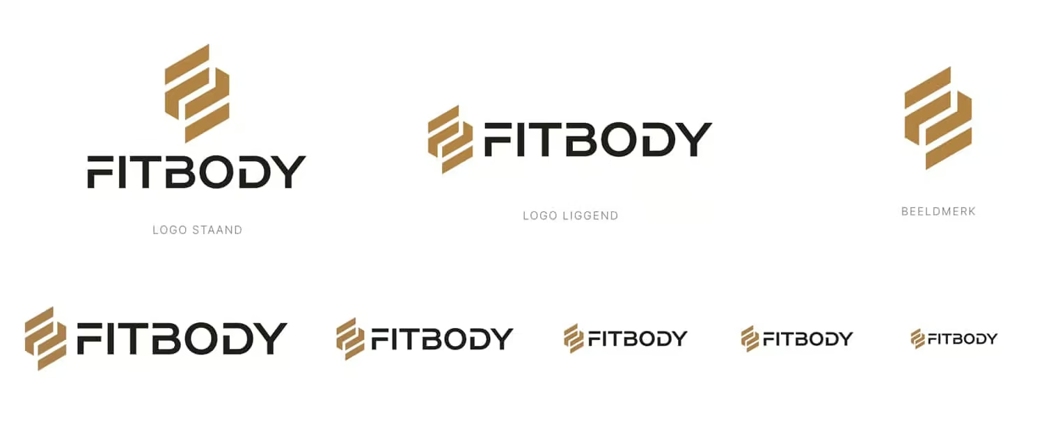
Scalability is also always central during design. Here the Fitbody logo we designed for this personal training studio in Breda.
→ The proportions are correct; letters that are crooked, elements that are out of balance, elements where you feel that it's 'not quite right.'
→ Typography is thoughtful; not random typefaces, but a selection that strengthens your brand.
→ Colour harmony is intentional; not randomly chosen, but strategic.
This is also where the 'free' logo tools fail miserably. They squirt some shapes and letters together and call it done. That's not designing; that's shooting without direction.
In short: good logo design is strategic
A strong logo design isn't beautiful — it's meaningful. It aligns with your brand identity and strengthens every touchpoint. View my approach if you want to know how I tackle that.
Why technical perfection makes your logo immortal
If your logo is technically sound, then it grows with your brand. You can use it on a business card, on a website, on a billboard, embroidered on your uniform. It works everywhere. Those are the brands that endure. Those are the logos you still hear about after ten years.
A good logo works in every shape and every format.
This is the last pillar, but certainly not the least. Your logo must be a chameleon. Horizontal, vertical, compact, extended; it must be able to adapt without losing its soul.
How do you design a logo that fits everywhere?
You need:
→ A primary version; the logo in its fullness.
→ A variant for when you want to use it horizontally.
→ A stacked version; useful for narrow spaces.
→ An icon; the logo reduced to its most essential form.
All of them must shine in black and white. All of them must be scannable at centimetre size. All of them must make your brand recognisable.
The Fitbody logo is a good example of this. Designed with this in mind. Horizontal for full width. Stacked for social media. Iconic as a symbol. And everywhere you can use it in greyscale without it losing power.
Epilogue: from disposable to essential
Logo design isn't difficult. What's difficult is the deep work beneath it. The thinking. The strategising. The asking questions. Once you're engaged with that, the designing actually becomes very clear.
A good logo communicates. Is relevant. Contains something unforgettable. Is technically perfect. And fits everywhere. Those four pillars; that's what you need.
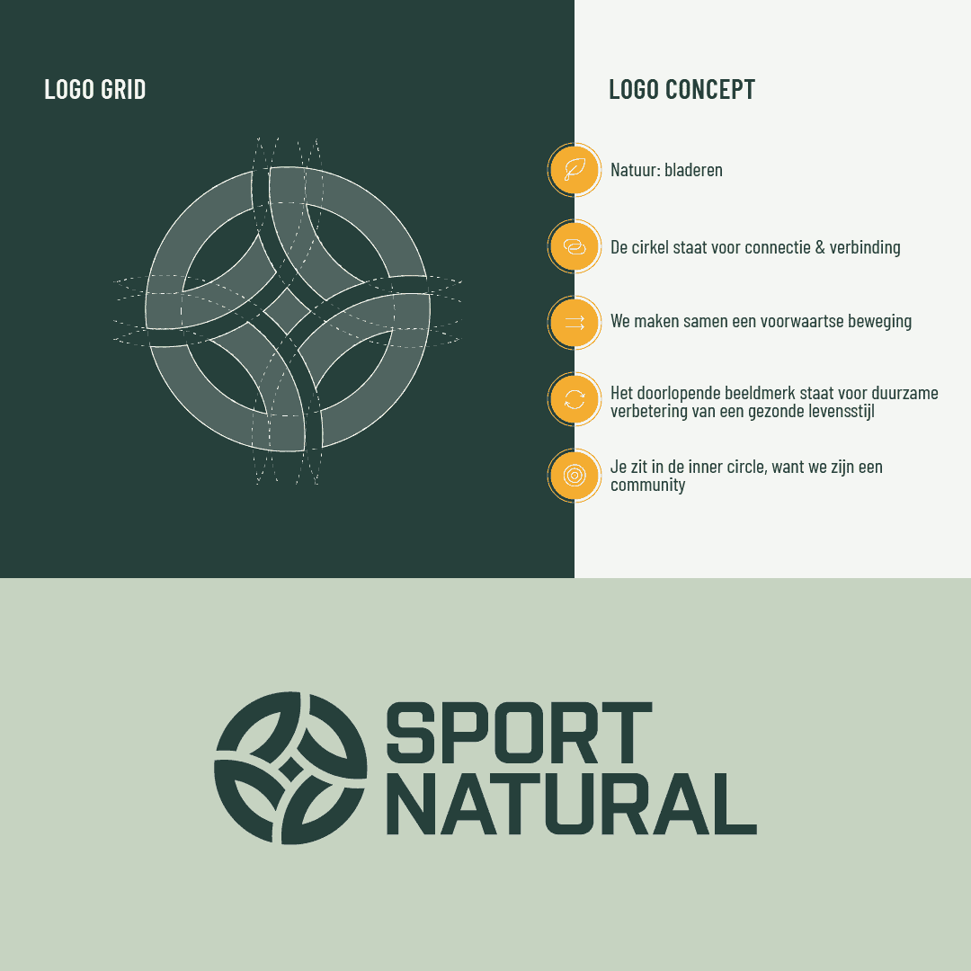
The logo of Sport Natural. We designed this logo entirely based on the pillars of the brand story.
The question you can now ask yourself is: do I have that now? Or is it time for a redesign?
Ready for the next step?
If your brand identity needs to be just as essential as your logo, then the moment has arrived to take steps with it. Not vaguely 'somewhere in the future', but now. Discover here how to get your brand fully in top form; from strategy to execution.