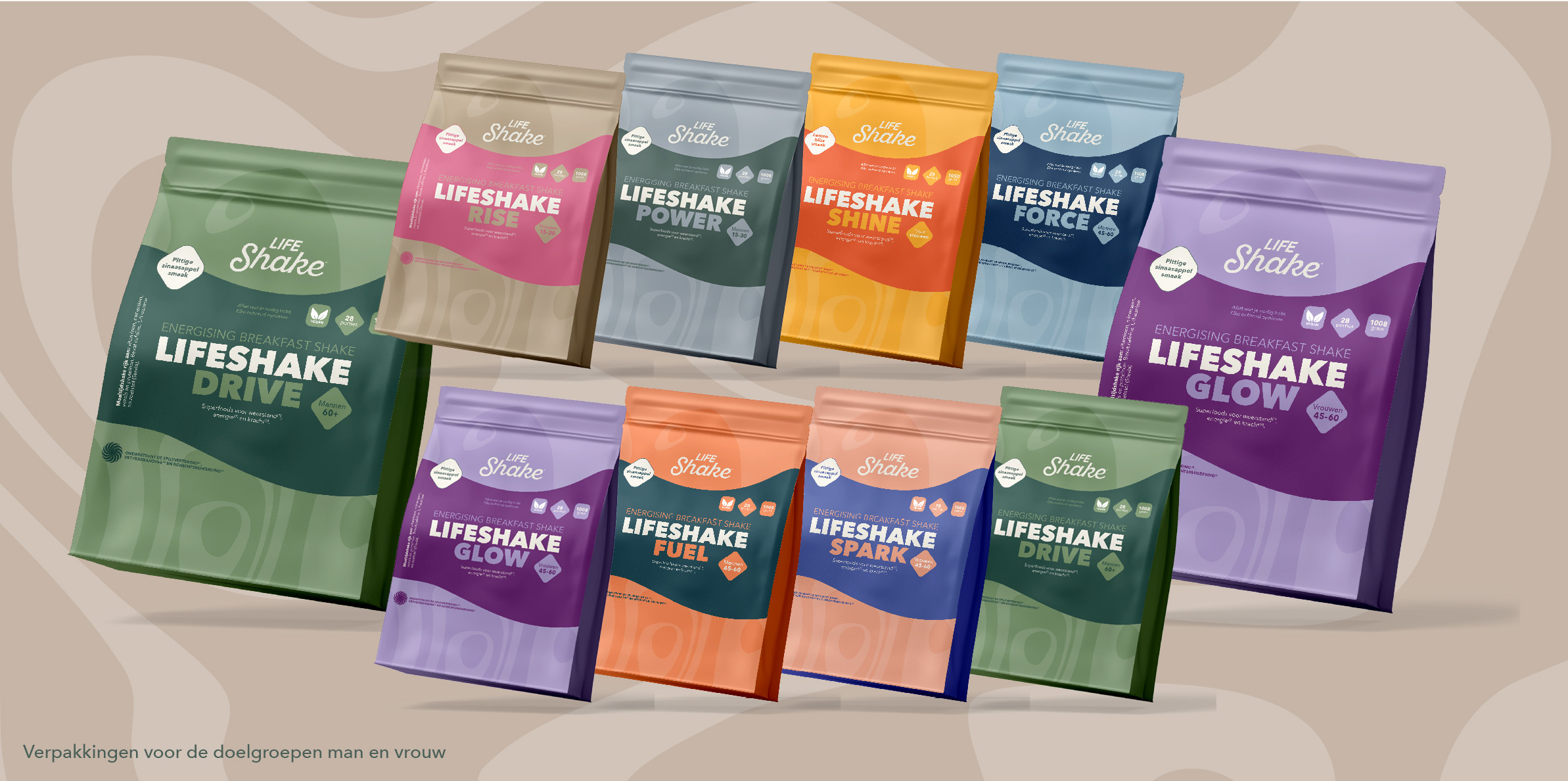
For LifeShake® we designed the new brand identity that feels like nutrition with a smile. Eight packs for breakfast shakes. Each tailored to a different life stage and for men and for women. From young to old.
We started with the why. Why eight variants? Why are you focusing on breakfast shakes by age? What should everyone feel each morning when they have a LifeShake?
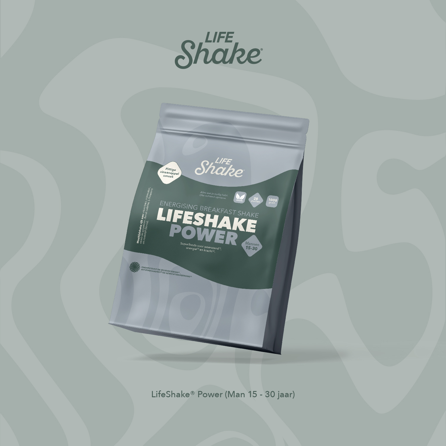
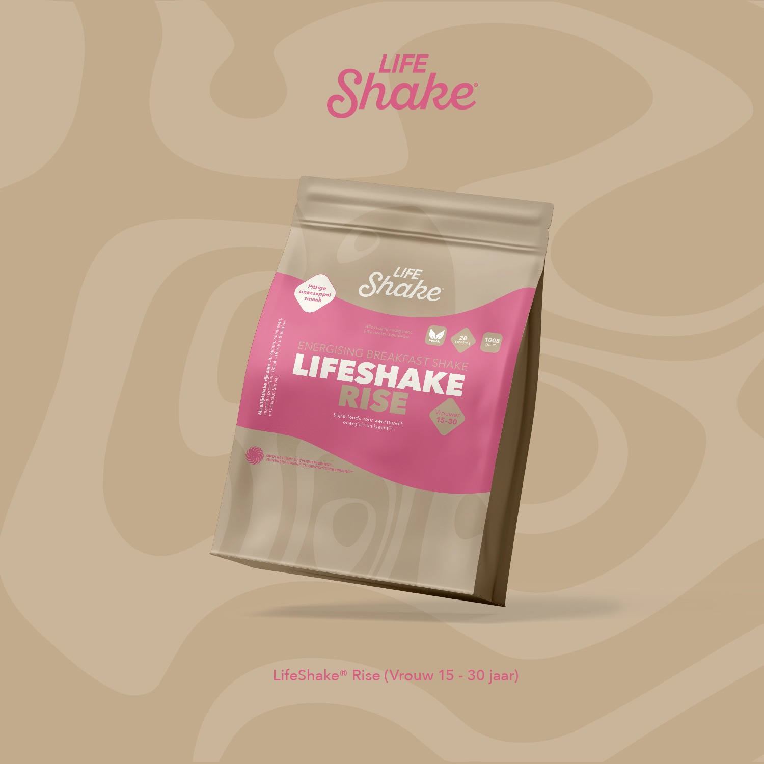
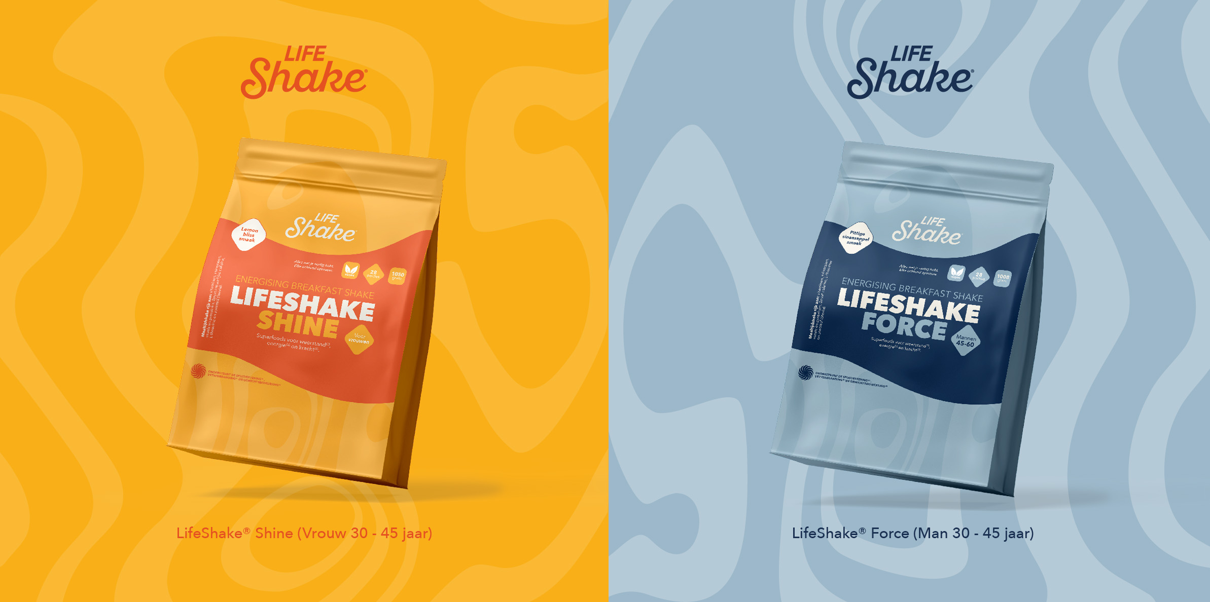
Each shake has its own name and its own colour. Shine is for women from 30 to 45 in orange. Force is for men of the same age in blue-grey. Power is for men from 15 to 30 in dark green and Rise for women from 15 to 30 in pink.
The whole line stands side by side. Rise. Power. Shine. Force. Glow. Fuel. Spark. Drive. Each pouch has its own colour tailored to the target audience. Power appears on a green-grey background with a wave pattern and Rise on a sand-coloured background with the same wave pattern.
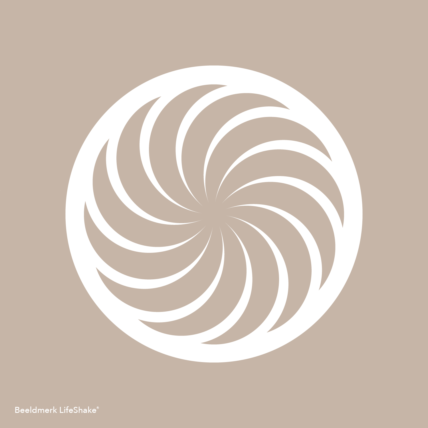
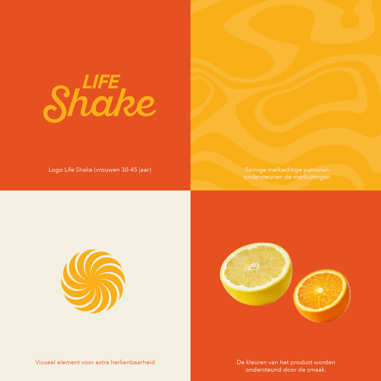
Each product gets its own colour identity and energy without losing what the brand stands for. The visual language consists of soft milky patterns that evoke the essence of a well-blended shake. Warm and inviting. The rotating brand mark stands for dynamism and vitality.
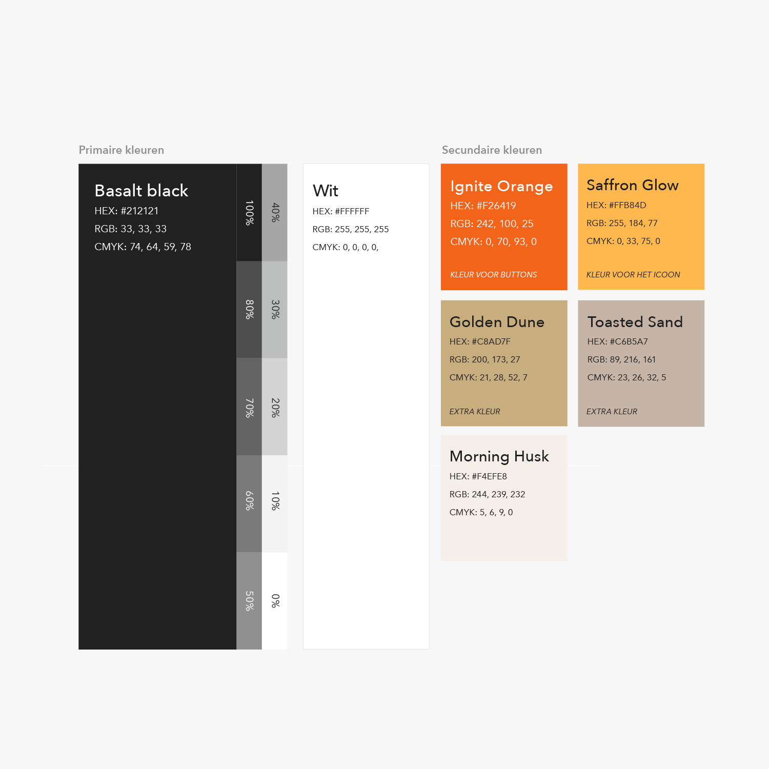
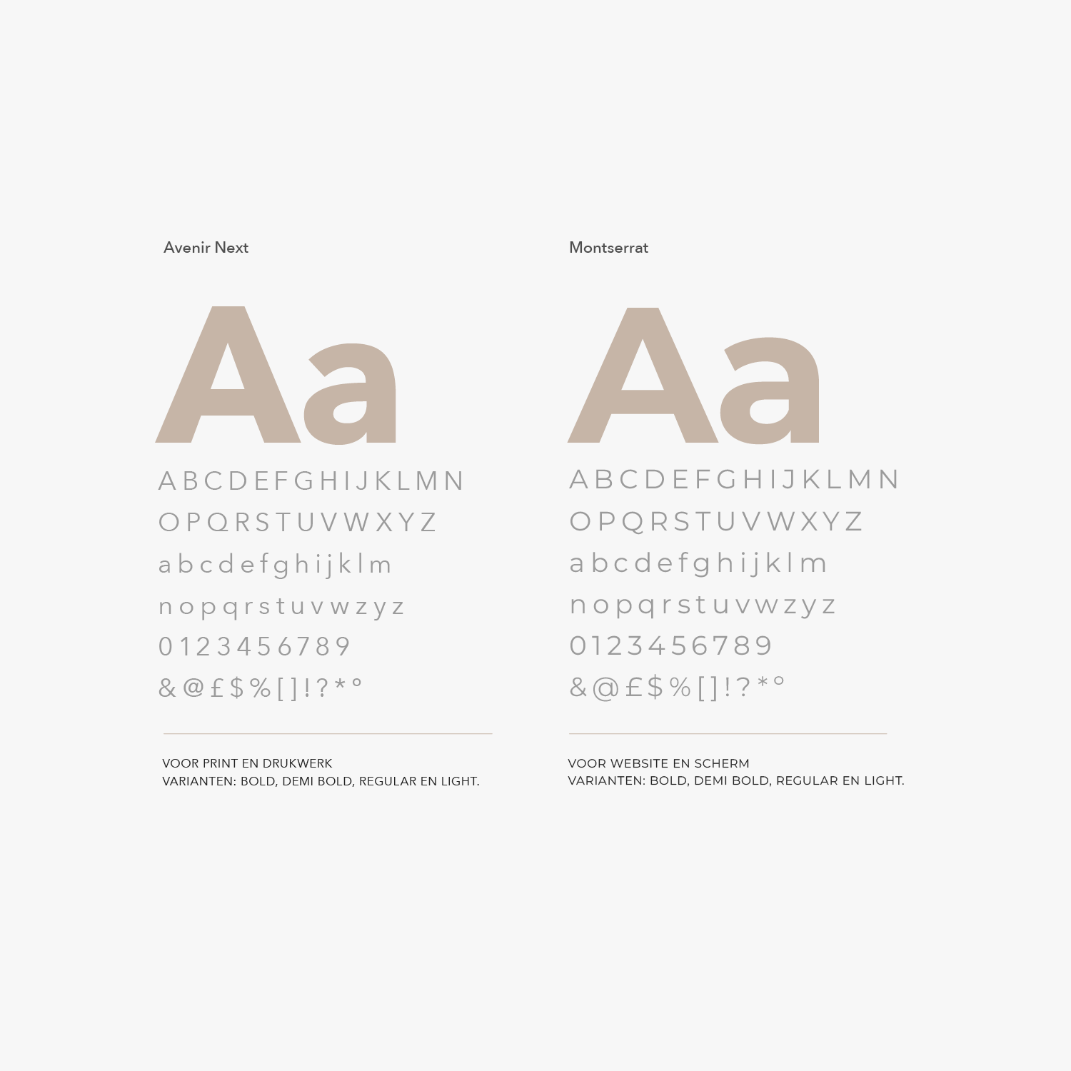
Basalt Black and white form the basis of the palette. To these come five warm shades from Ignite Orange to Morning Husk. The moodboard revolves around warm orange and yellow tones with a wave pattern and orange segments. For typography we use Avenir Next for print and Montserrat for screen.
The round swirl brand mark works right down to the website favicon. The logo exists in two colour variants: on cream and on black.
Voor de doorontwikkeling van LifeShake hadden we iemand nodig die niet alleen maar ontwerpt, maar strategisch meedenkt. Bij Peter van der Steege voelden we meteen dat hij het merk eerst beter wilde begrijpen. Hij begon met het waarom. Waarom acht varianten? Waarom richten jullie je op leeftijdsgebonden ontbijtshakes? Wat moet iedereen elke ochtend voelen als ze een LifeShake nemen?

M. Verbruggen
Marketing manager