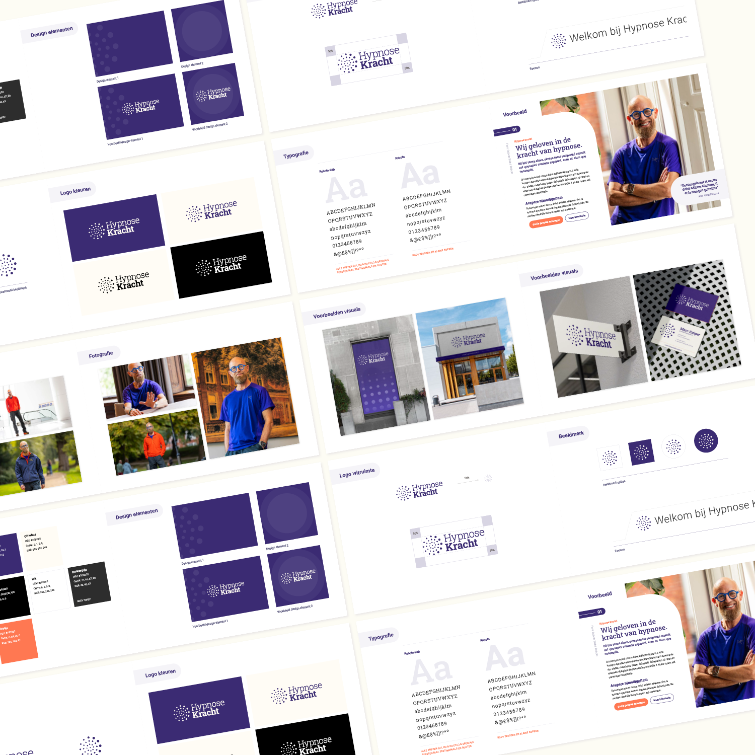
For physiotherapist and hypnotherapist Marc Kuiper, we developed the complete foundation of his brand. From brand strategy and naming to logo and photography. All with one goal in mind: a brand identity that inspires confidence and speaks directly. We also came up with the brand name: HypnoseKracht.
The question started with Marc himself. He knew he had a good story but didn't know how to express it visually and strategically.
We began with a sharp positioning. No airy-fairy story but a clear brand strategy that presents hypnosis as practical mental strength training. The name HypnoseKracht was the logical next step. As was a visual style that radiates calm and authority and balance.
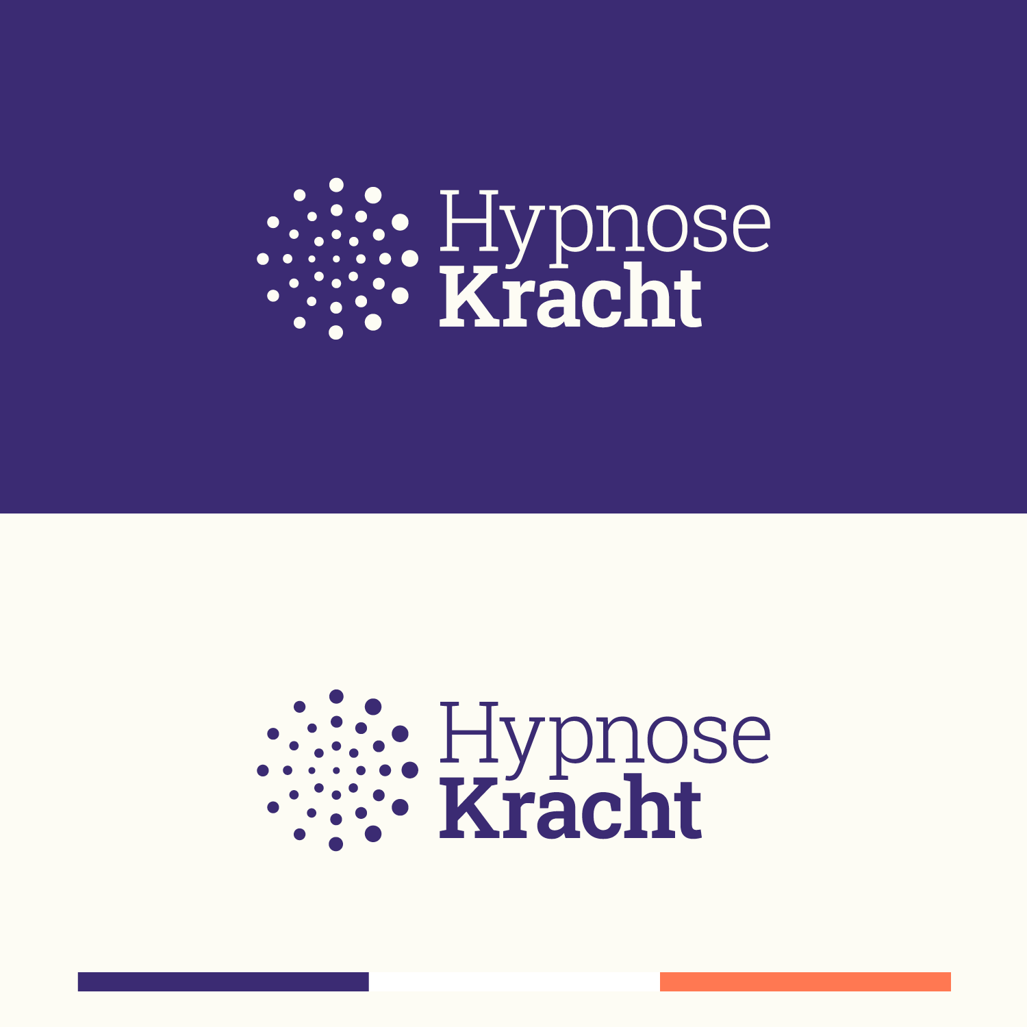
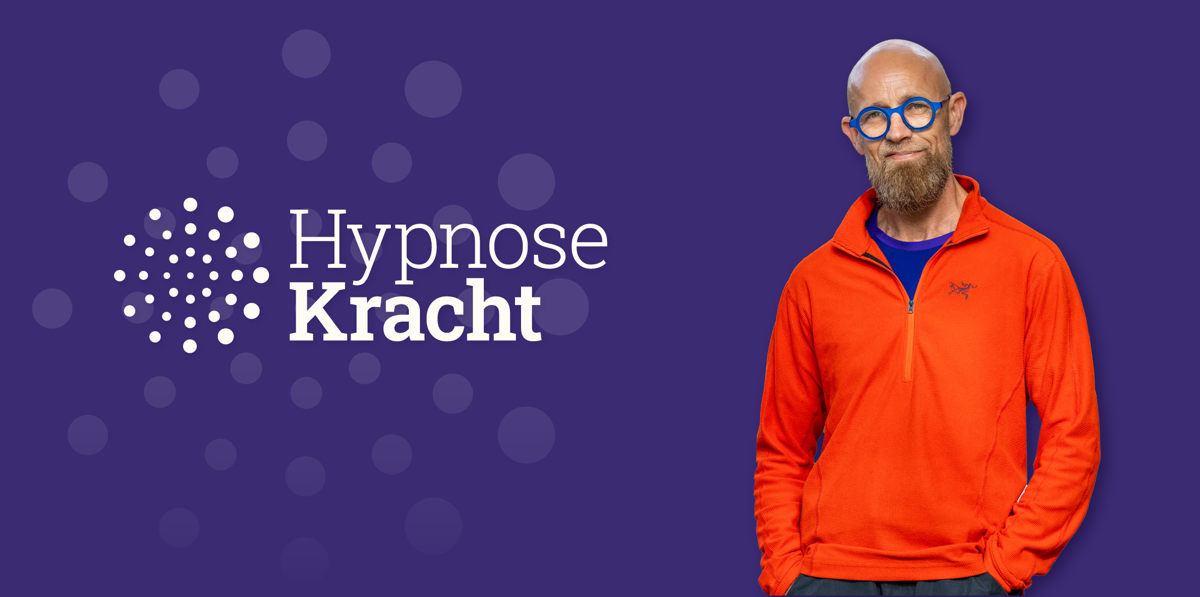
The logo has hypnotic dots. You fix your gaze and let yourself be carried away to deep relaxation and mental strength. The colour palette consists of deep purples for mystery and depth. Added to that is a bright orange for warmth and optimism. Together they reflect the balance between strength and serenity.
The core values are trust and transformation and inner strength. Every detail in the imagery and the style is aligned with these.
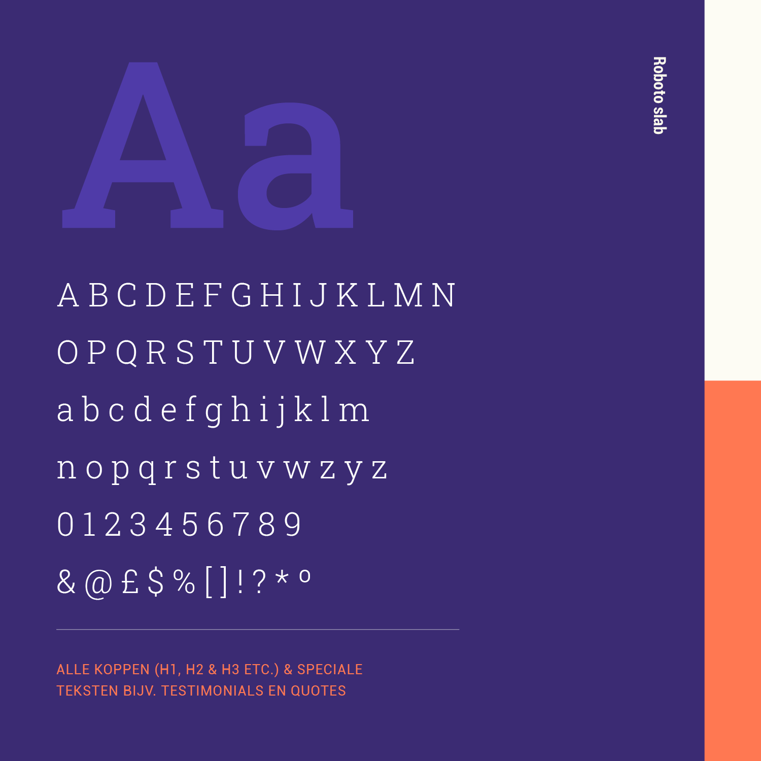
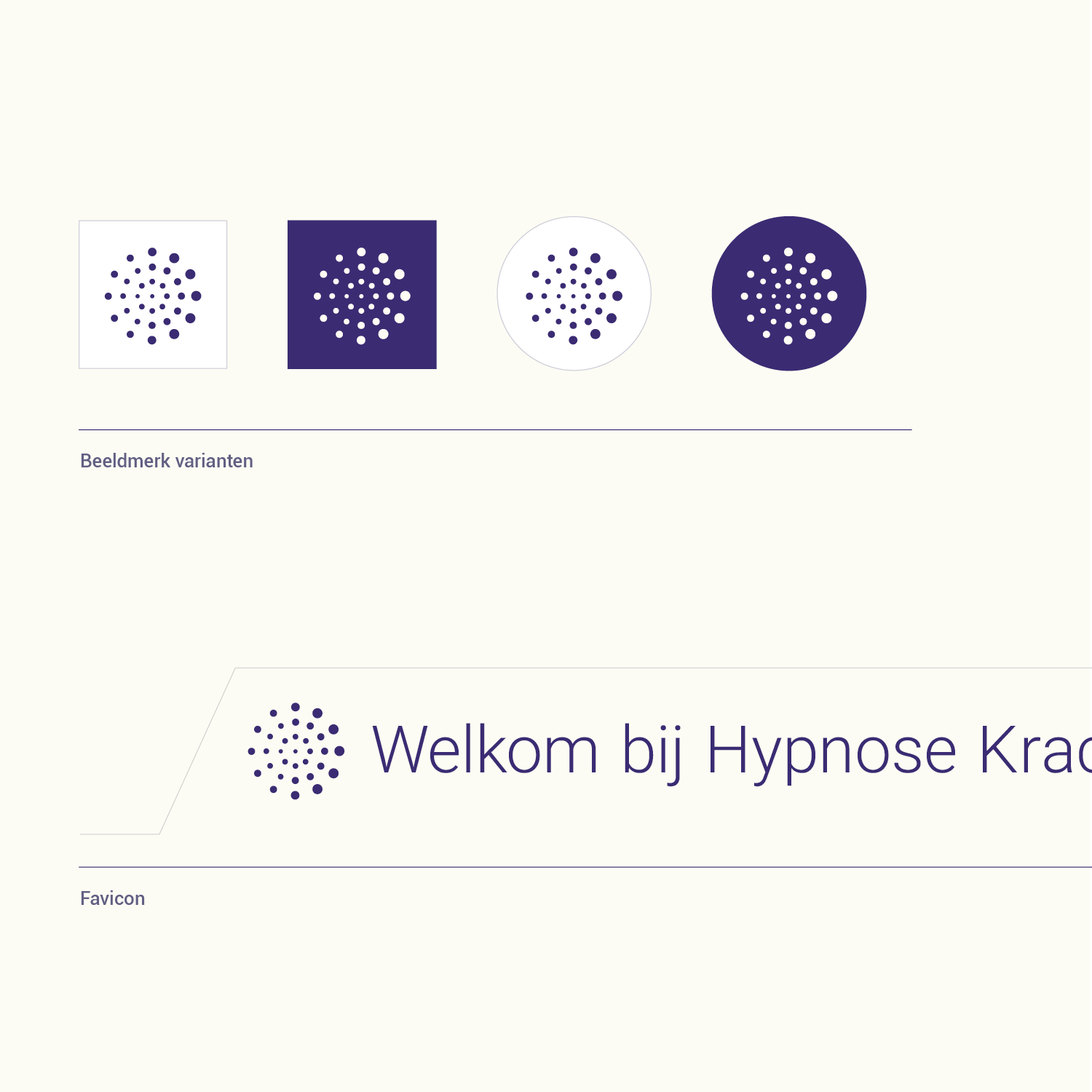
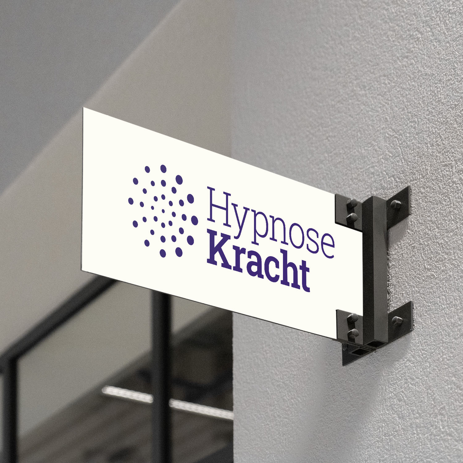
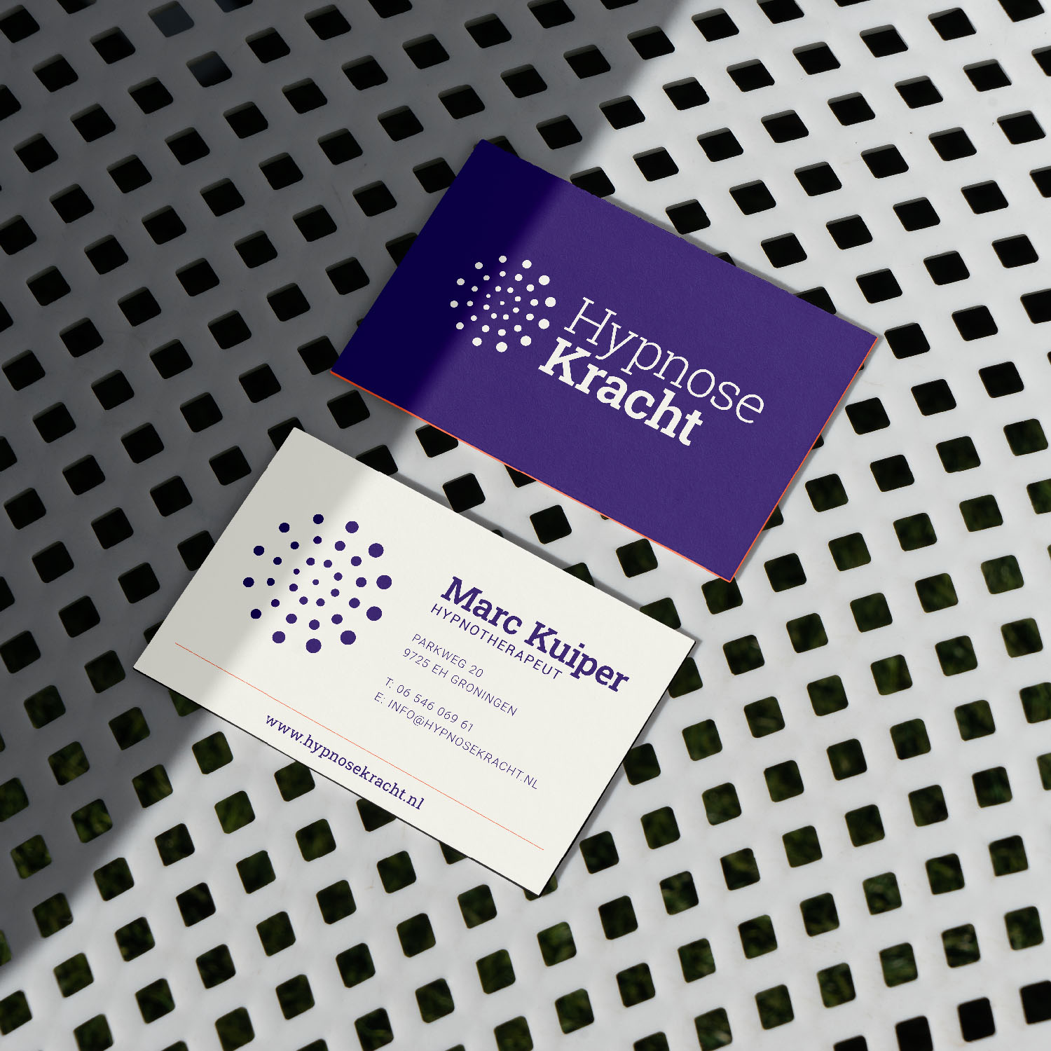
The typography is sleek and modern. Roboto Slab gives a robust yet accessible character and reinforces the confidence that HypnoseKracht wants to convey. The brand received a style guide with logo variants in different colour combinations and a favicon. There were also business cards and a fascia board and a mood board of the house style with screens from the website. The fascia board hangs on black brackets against a rendered wall.
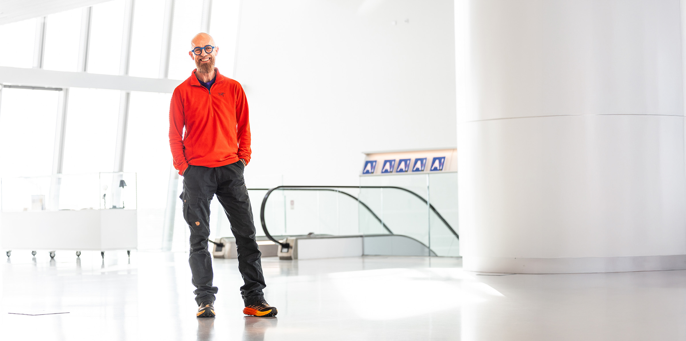
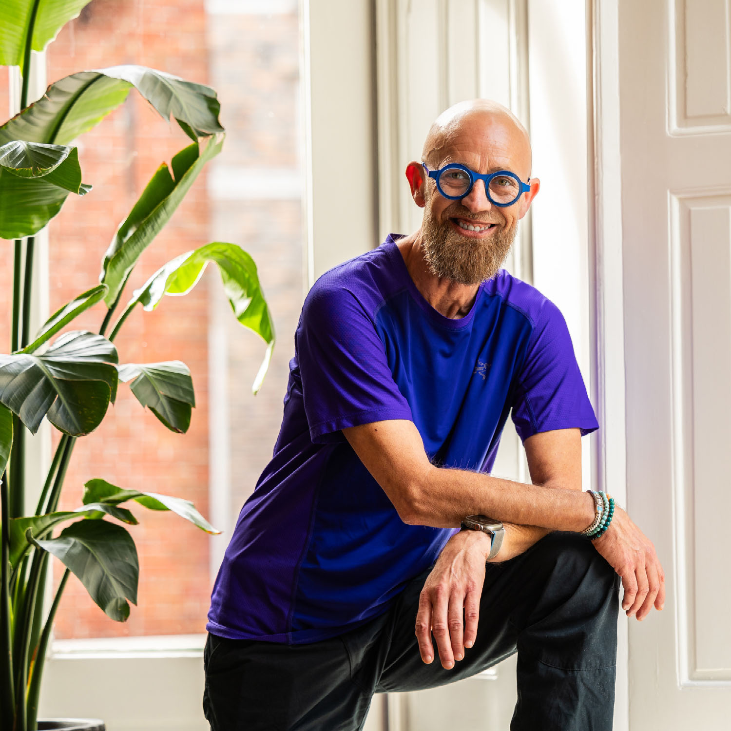
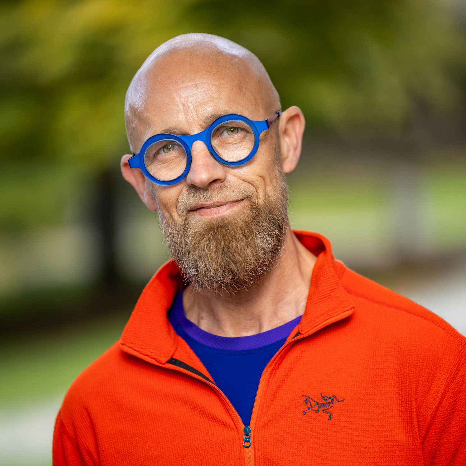
We also produced the photography in-house. No stock but images that genuinely tell something about Marc. The emphasis is on calm and focus. Personal and powerful and accessible. In the images he wears an orange fleece. You see him against a purple background with the dot pattern from the logo. Outside against a green background. And in a modern white interior.
In this way we built a brand together that moves people and stays with them.
“Ik wist dat ik een goed verhaal had, maar ik had geen idee hoe ik dat visueel én strategisch moest neerzetten. Peter en zijn team hebben me daar ongelooflijk goed bij geholpen.
Marc Kuiper
Hypnotherapeut