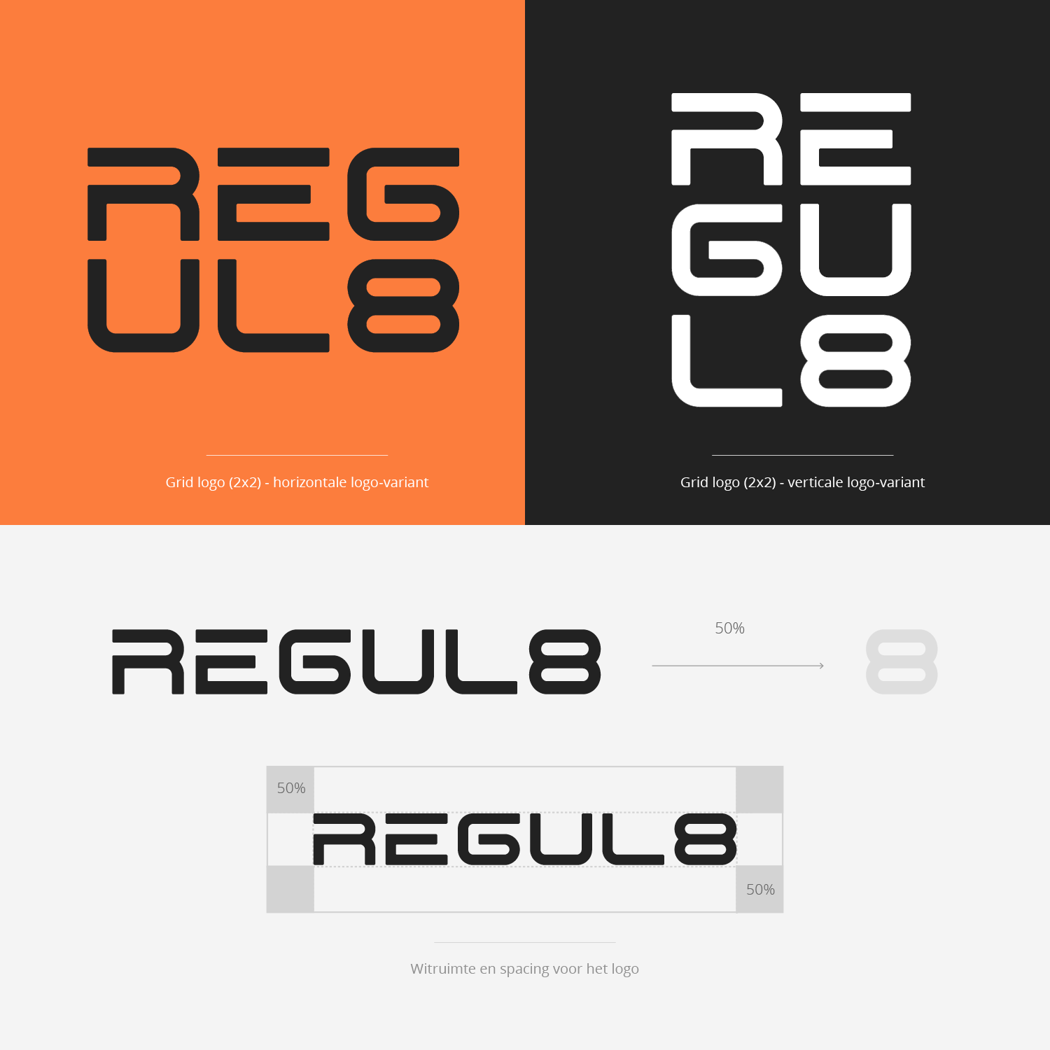
REGUL8 asked for clarity. Not shouty fitness branding but a system that creates calm and provides direction. Together with my team I built a brand identity that centres on balance and simplicity. At its heart sits the clean wordmark and the eight building blocks that carry the full range of services. From Move to Grow.
REGUL8 began as a physiotherapy practice in Noordhorn and grew into a gym where people are more than just a member. Owner Johan Oostland wanted to see that reflected in everything the brand shows. In the logo. On the website. In the photography. On the shopfront. No form without reason and no atmosphere that only exists on the homepage.
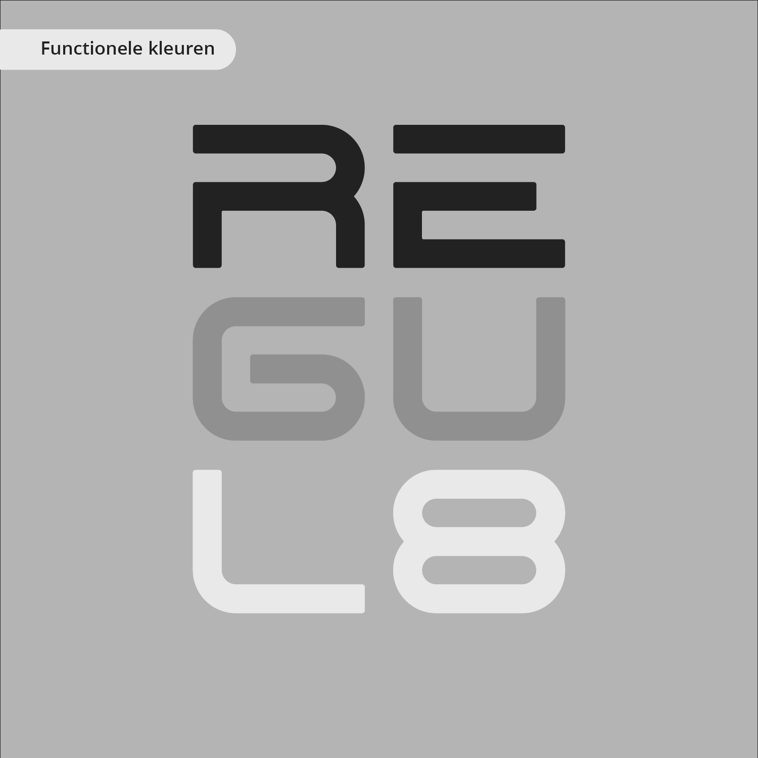
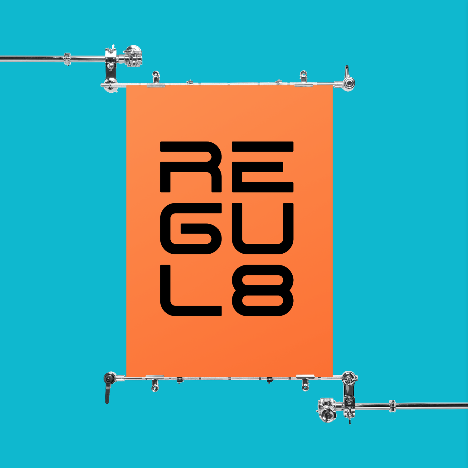
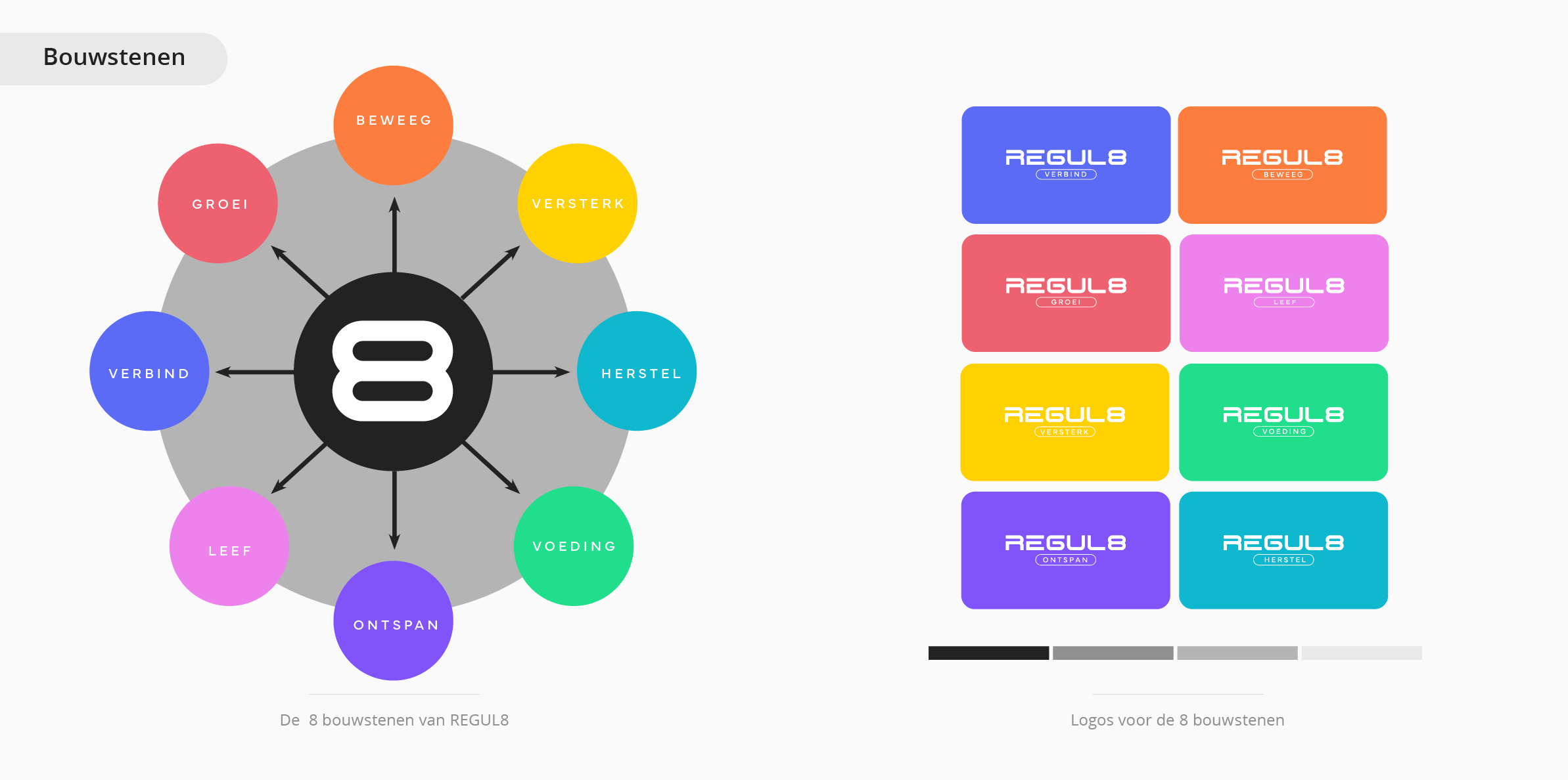
We didn't start with the logo. We started with the brand strategy and positioning: who is REGUL8 and for whom and why. That's where the name came in. A name with a number in it deserves a story. Otherwise it remains a design trick. I stood the eight upright as an infinity symbol. It represents the rhythm of continuous movement and the balance between exertion and recovery.
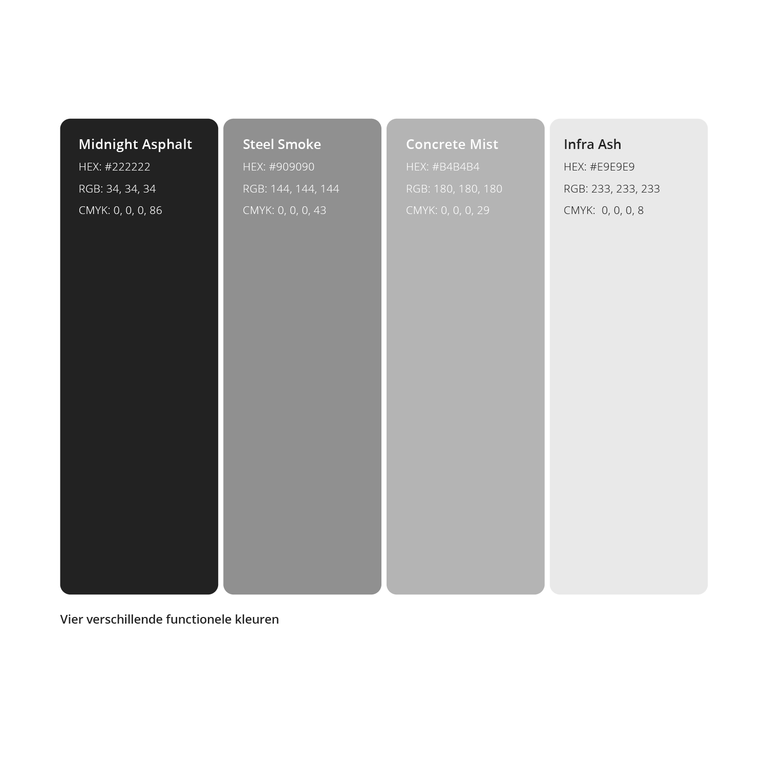
Between Move and Grow sit six more building blocks: Strengthen and Recover and Nutrition. Also Relax and Live and Connect. Each building block was given its own colour from the striking colour palette. Beneath these sit four functional greys that give the whole thing calm.
From that strategic layer followed the logo system and the typography. Also the label system for the materials and the shopfront signage. We did the brand photography ourselves. Strength training. Group classes. Spinning. Boxing. Reception. Real trainers and real members. No stock imagery.
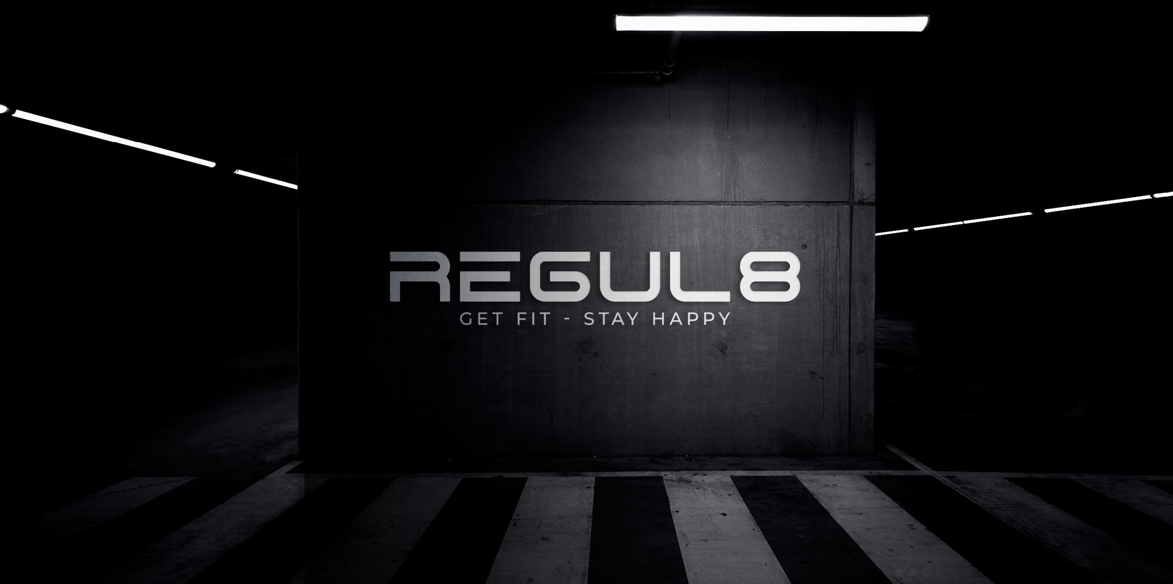
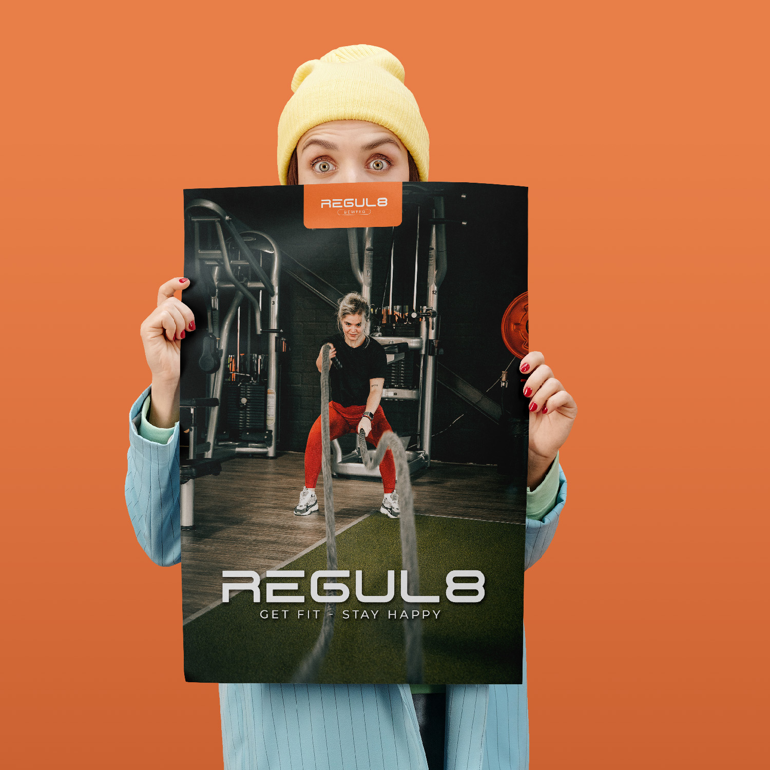
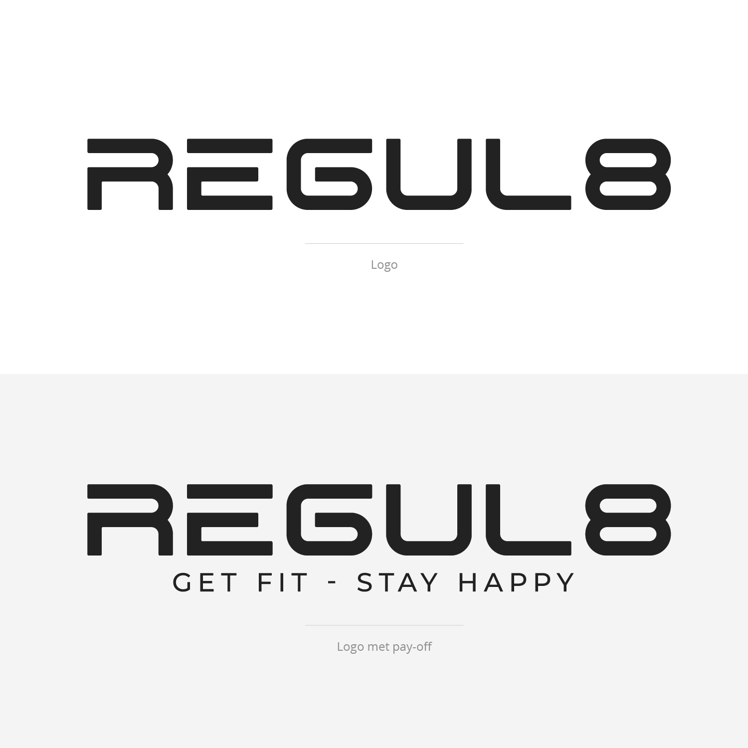
The wordmark also has a version with the tagline Get fit stay happy. In an atmospheric image it appears projected in a dark industrial space with light lines. There were also a magazine and an orange banner.
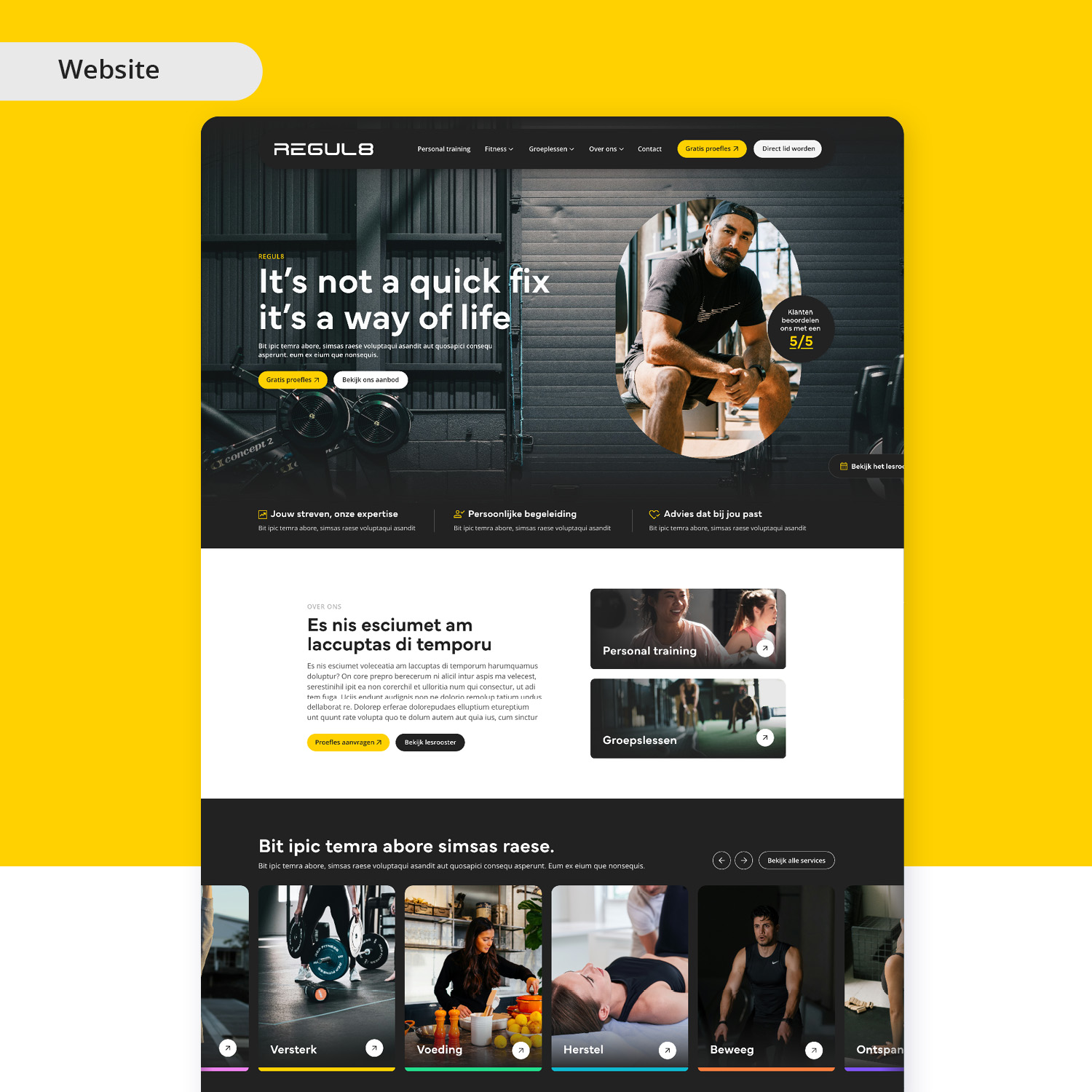
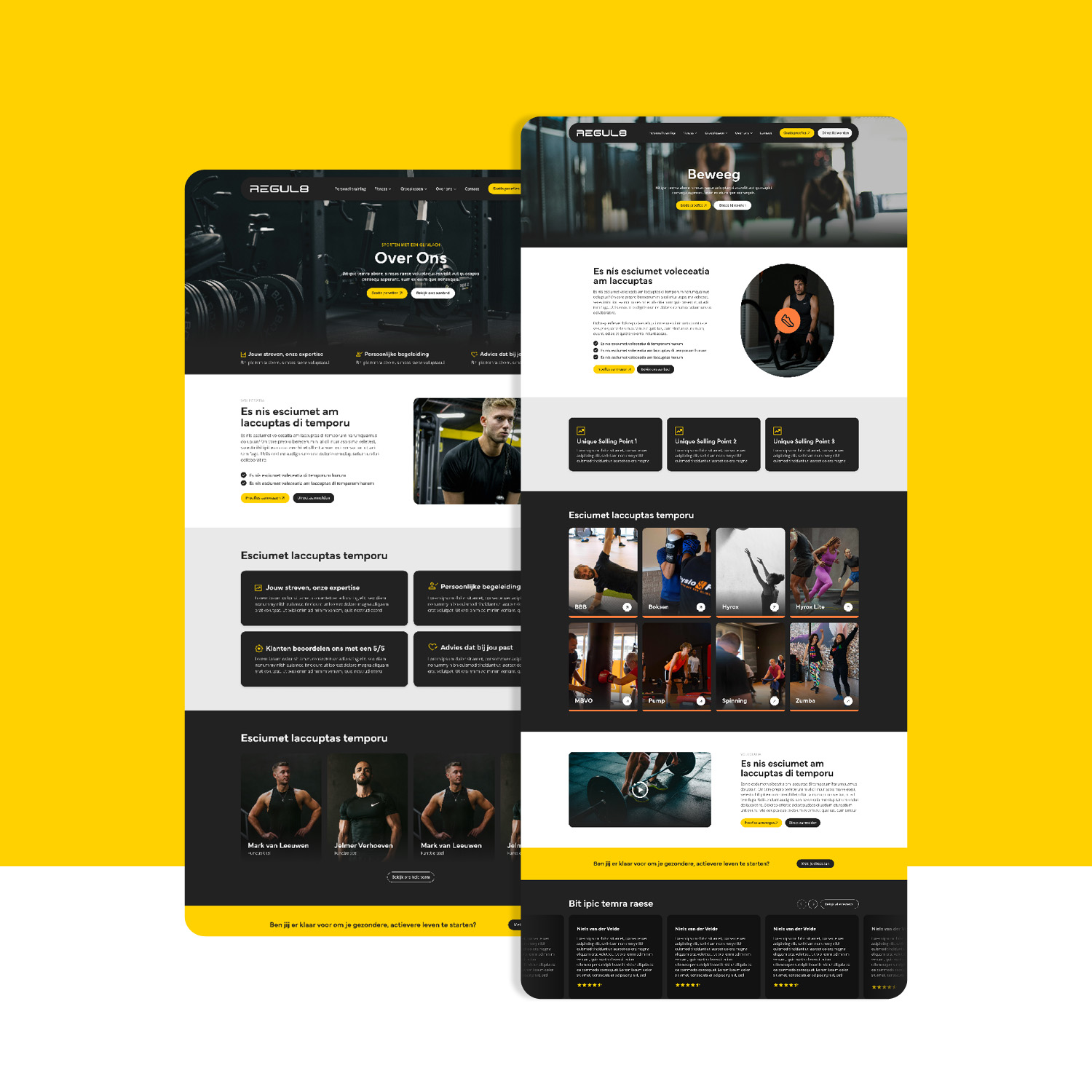
After that came the website and social media in the same tone. Personal attention as the common thread. Clear to navigate. Without the saccharine fitness clichés flooding the market. This way the identity lives just as strongly in the spinning studio as on Instagram.
REGUL8 didn't get a new outfit. It got a system that works.
“Wij zochten geen nieuw logo, maar een merk dat richting geeft. Peter en zijn team hebben dat voor REGUL8 uitzonderlijk goed neergezet. Het systeem van kleuren, bouwstenen en typografie zorgt voor rust, herkenbaarheid en focus in alles wat we doen. Het voelt eindelijk alsof ons merk klopt met wat we in de praktijk uitdragen.”
J. Oostland
Eigenaar