Rapide Software grew for years as a web agency from Groningen. It did a lot on many fronts. But as the projects got bigger, the name web agency felt too small. Rapide deliberately chose a sharper path: scalable B2B software and mobile apps and bespoke solutions for entrepreneurs who prefer to keep their software production in their own hands.
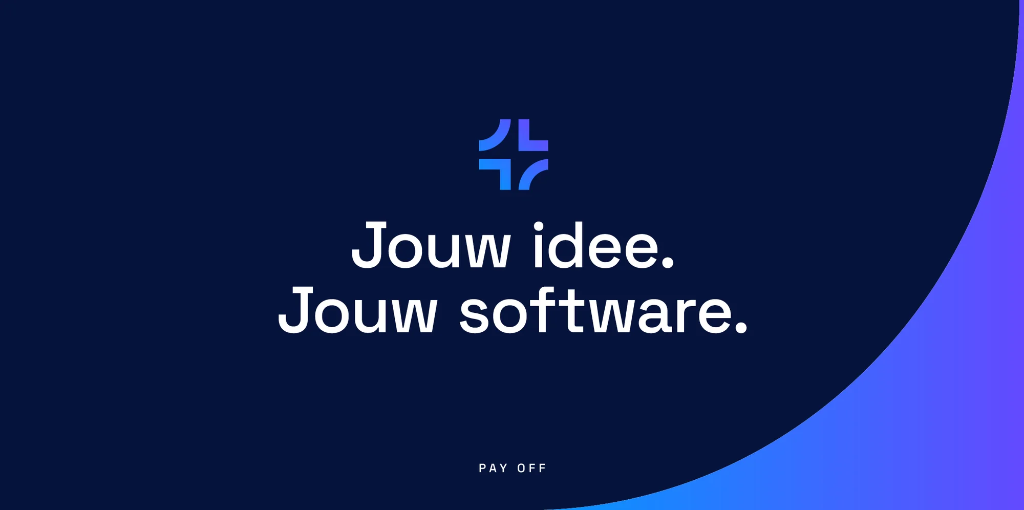
That kind of shift calls for a brand that inspires as much confidence as the software the company delivers. The process started on 2 May 2025 with a kickoff. We first looked for the foundation. A purpose. A positioning. A promise that goes beyond "we build software". That promise became: Your idea. Your software.
The core is quickly told. Rapide wants to be predictable and skilled. Honest when an idea isn't feasible. And focused on independence: letting the client go as soon as they can manage it themselves. The brand therefore speaks directly. It speaks expertly. And it speaks with commitment because Rapide builds alongside, not for the client.
Four brand actions make that behaviour concrete. Silence is not an option. Share what you learn. Doubts on the table. Write for your successor. The tone is informal but respectful and factual with energy. Serious with humour where it fits.
With the Launch Plan, Rapide now divides each project into five clear phases. From the first feasibility check to the moment when the client takes the wheel themselves. Each phase delivers a concrete result. Predictable in outcome and honest about what is and isn't feasible.
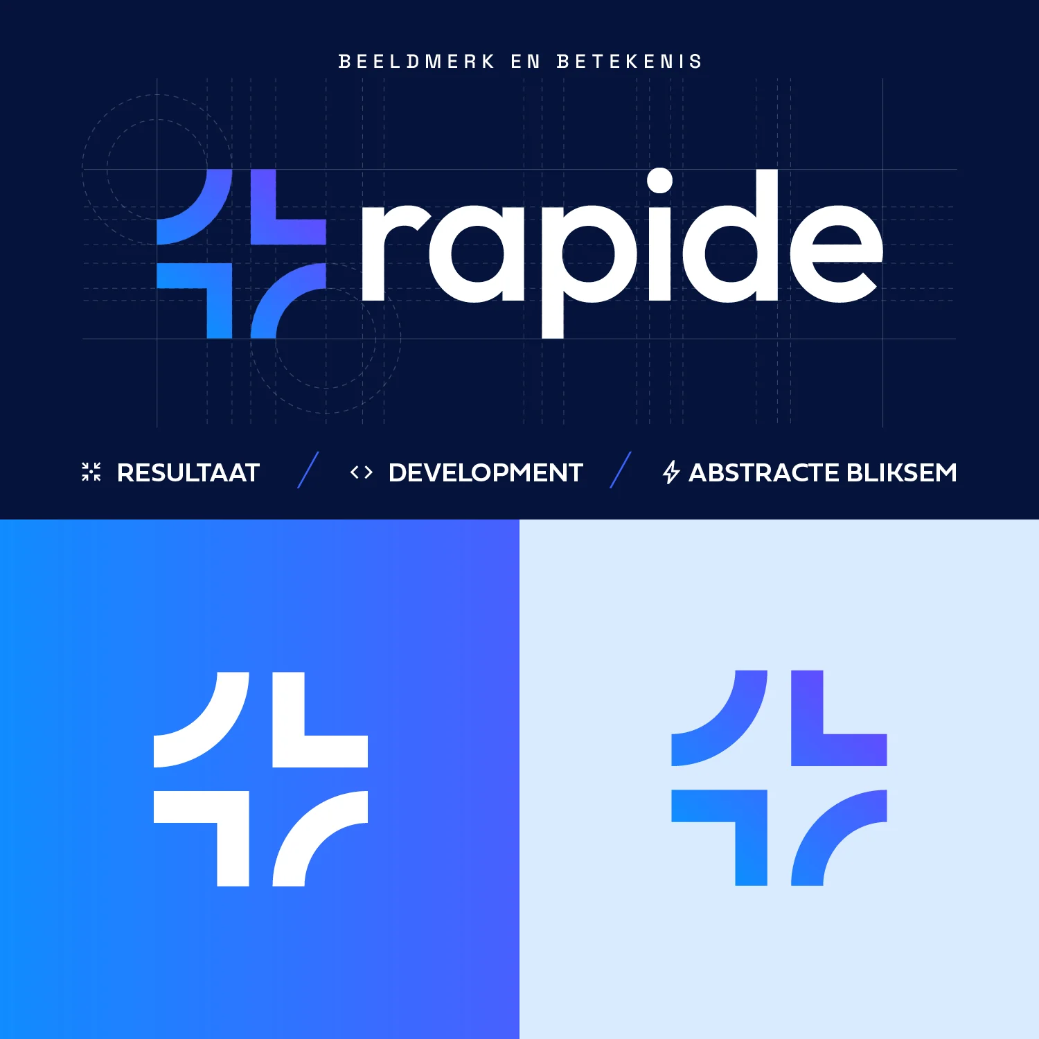
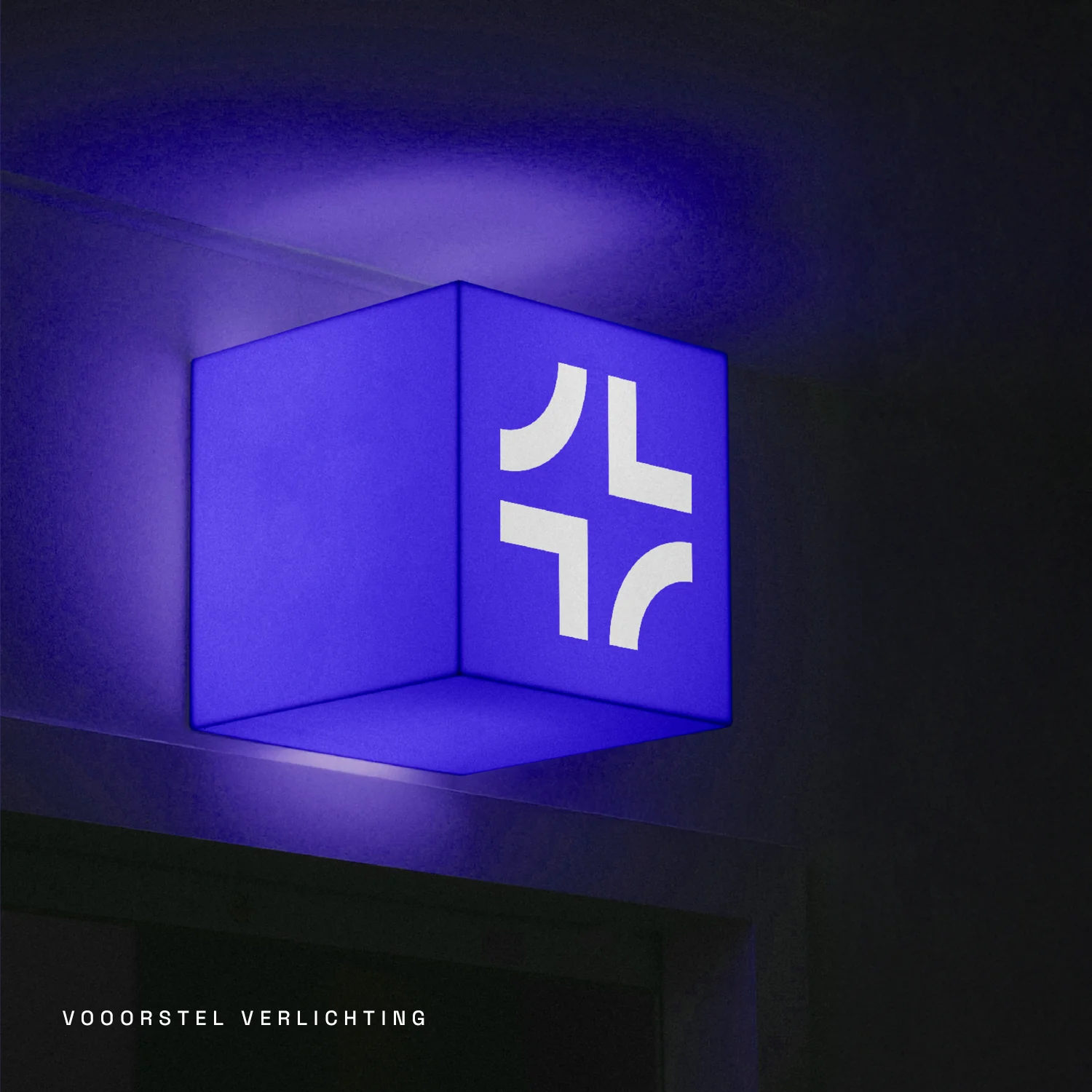
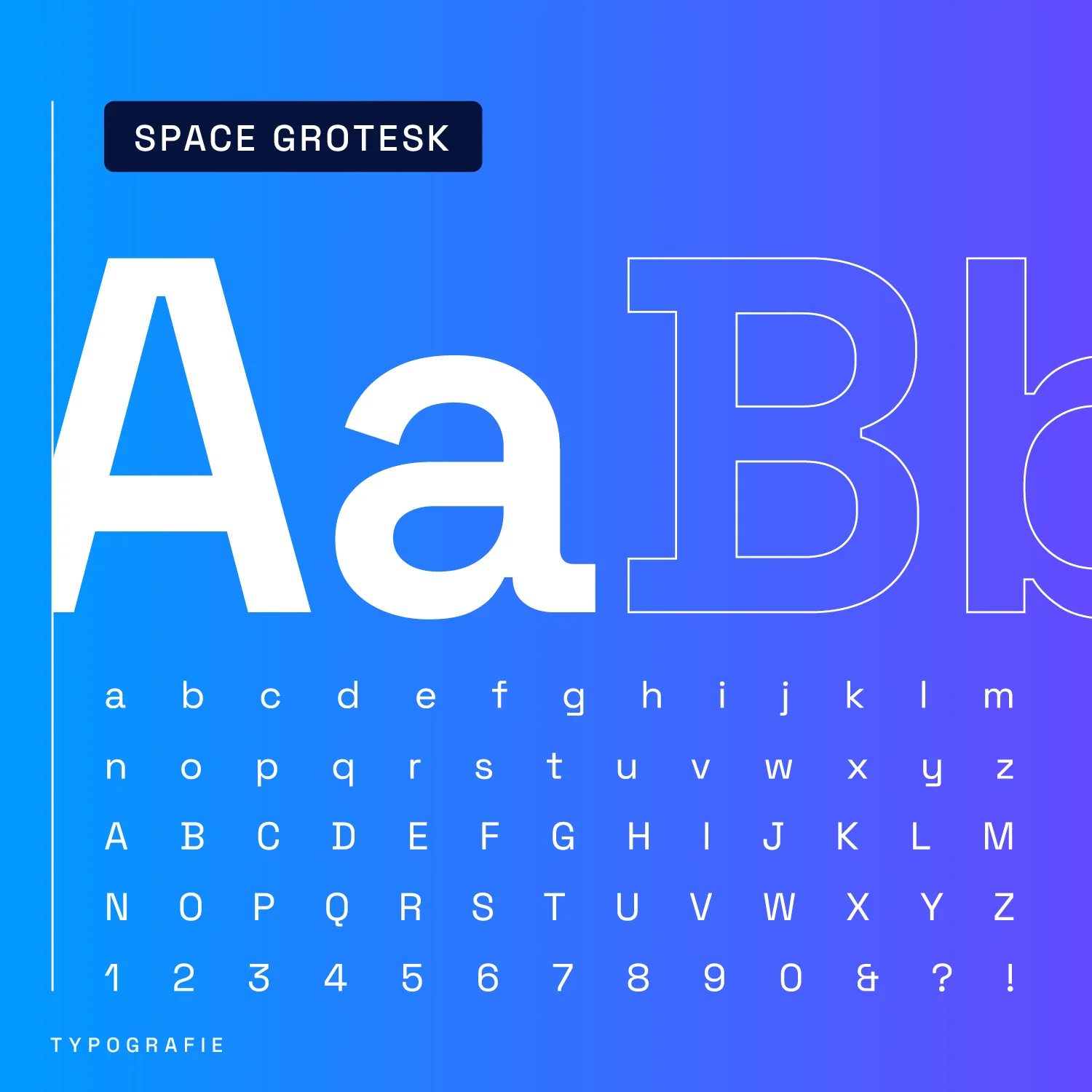
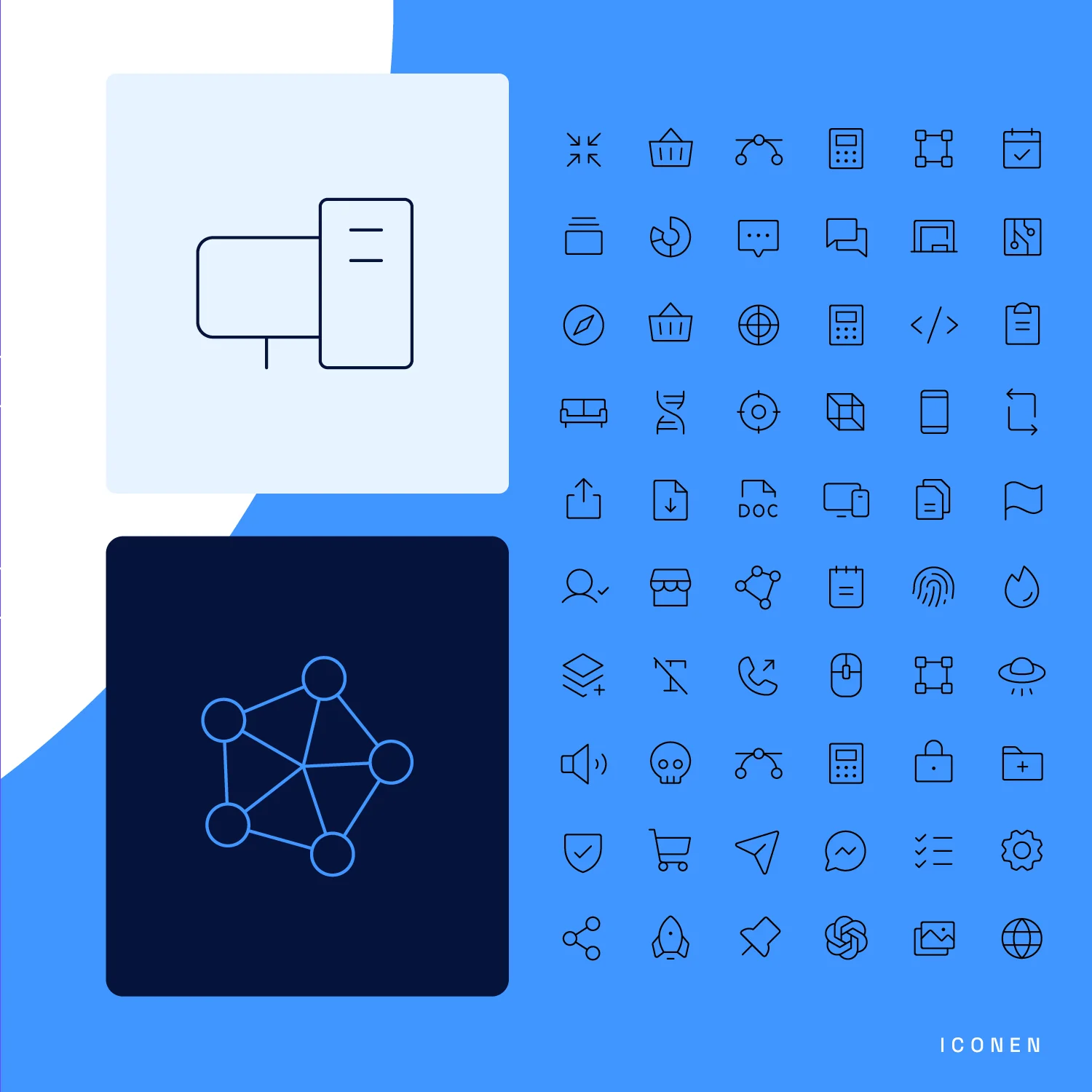
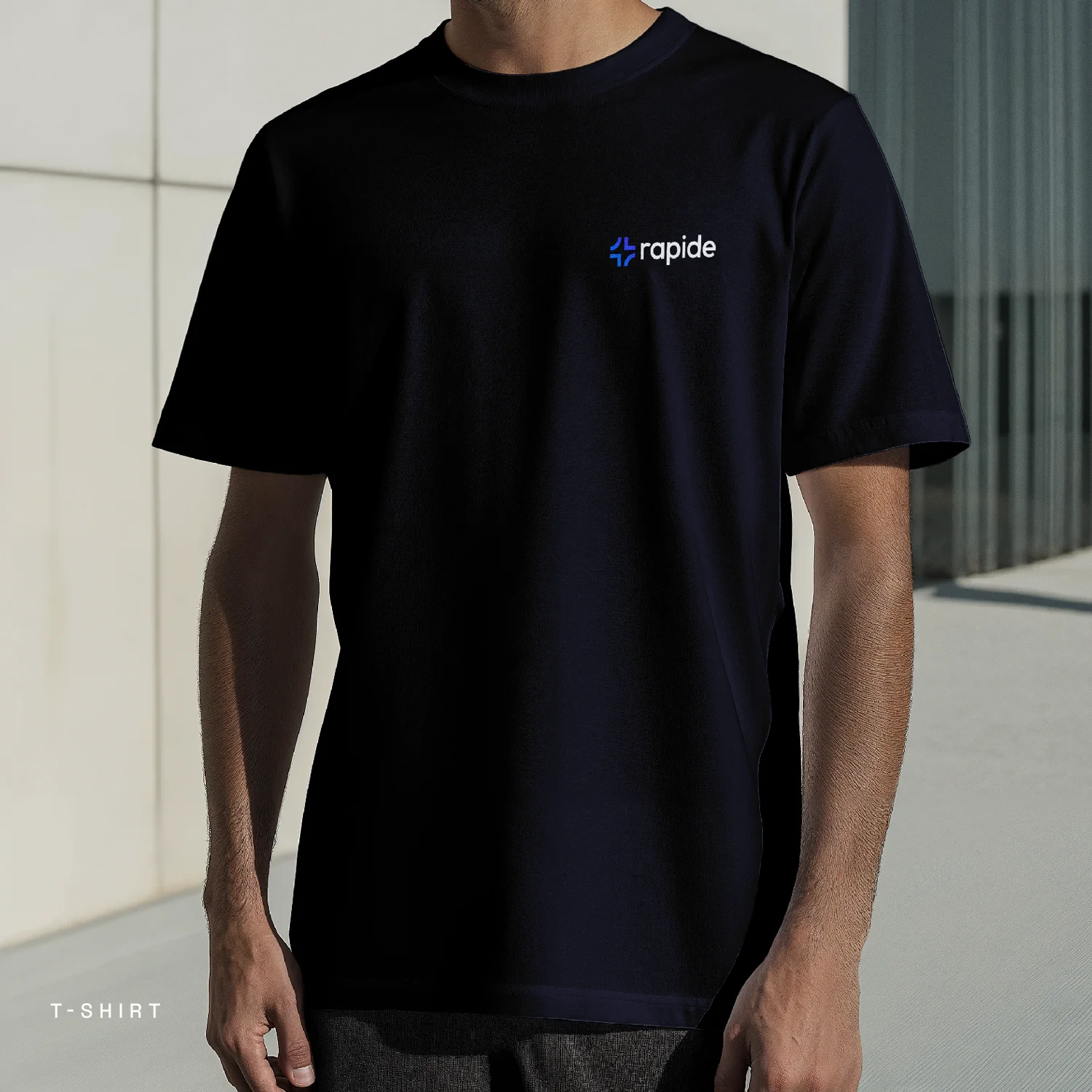
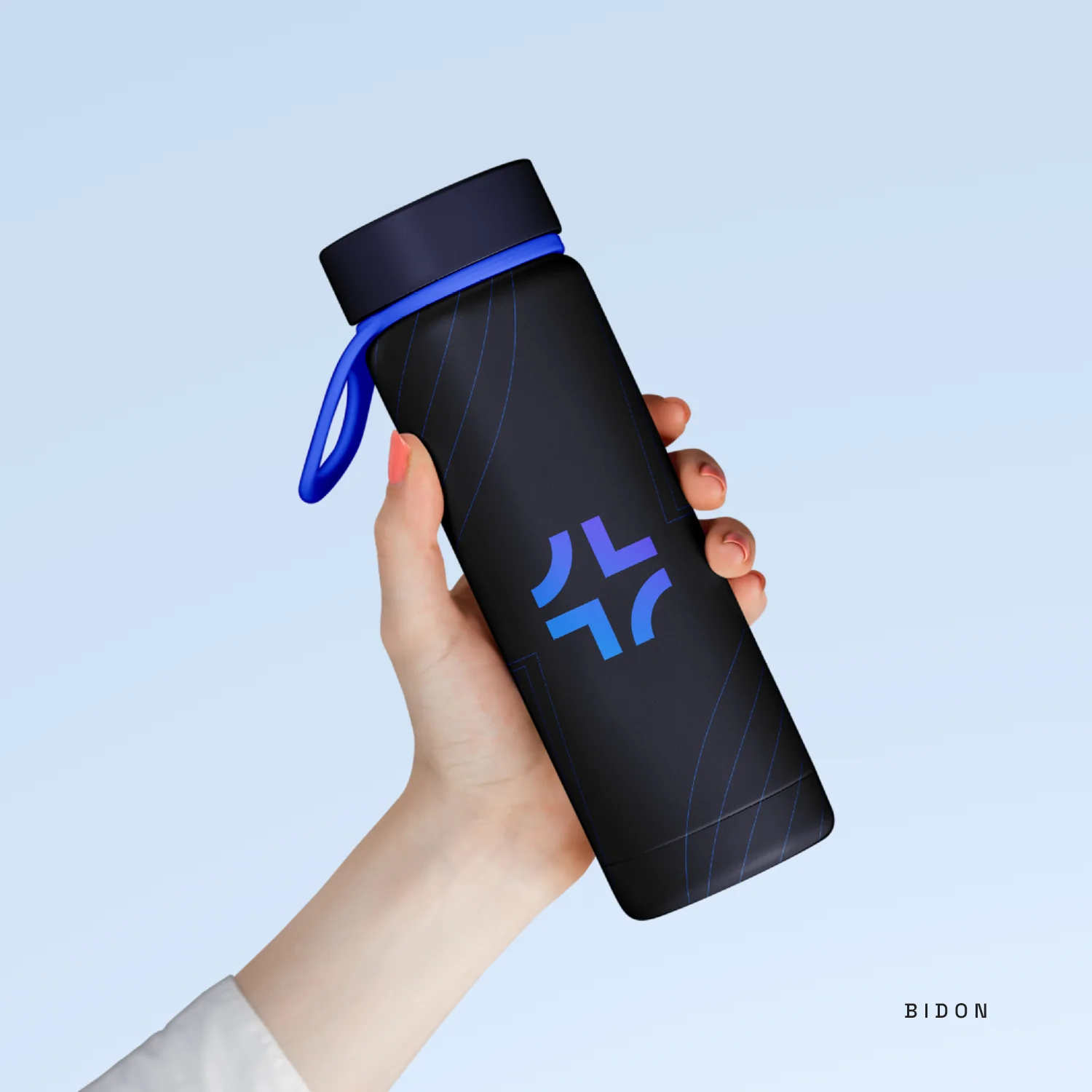
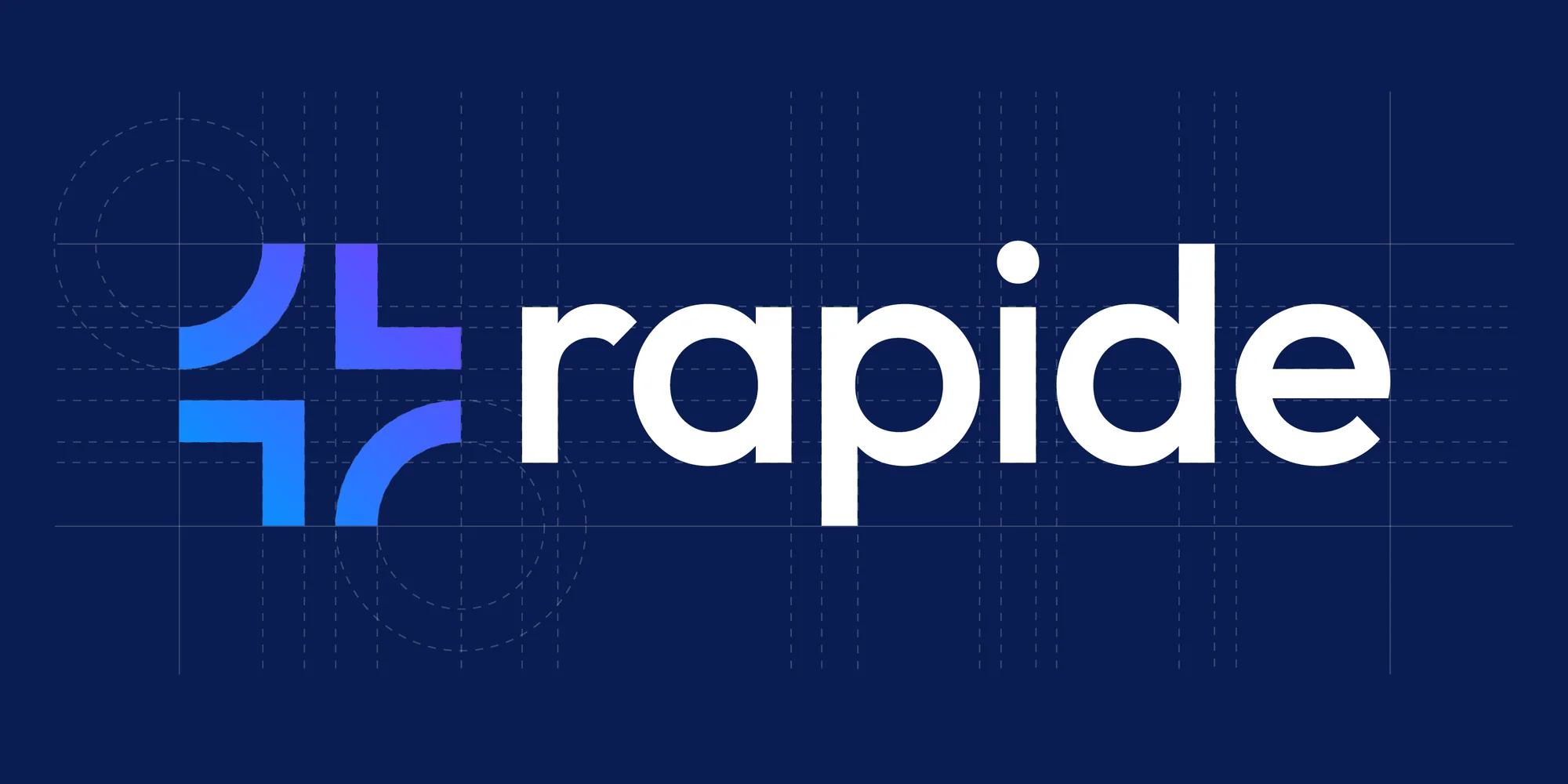
The visual identity makes that promise visible. The brandmark is a single cross shape with curved cutouts in which two mirrored r-shapes appear as negative space. The blue runs into violet within the mark. The brandmark also received a three-dimensional version as an illuminated cube: the proposal for the signage. Space Grotesk gives the headings the sharpness that suits software. A bespoke icon set was created. And the identity carried over to a T-shirt and a water bottle for the team.
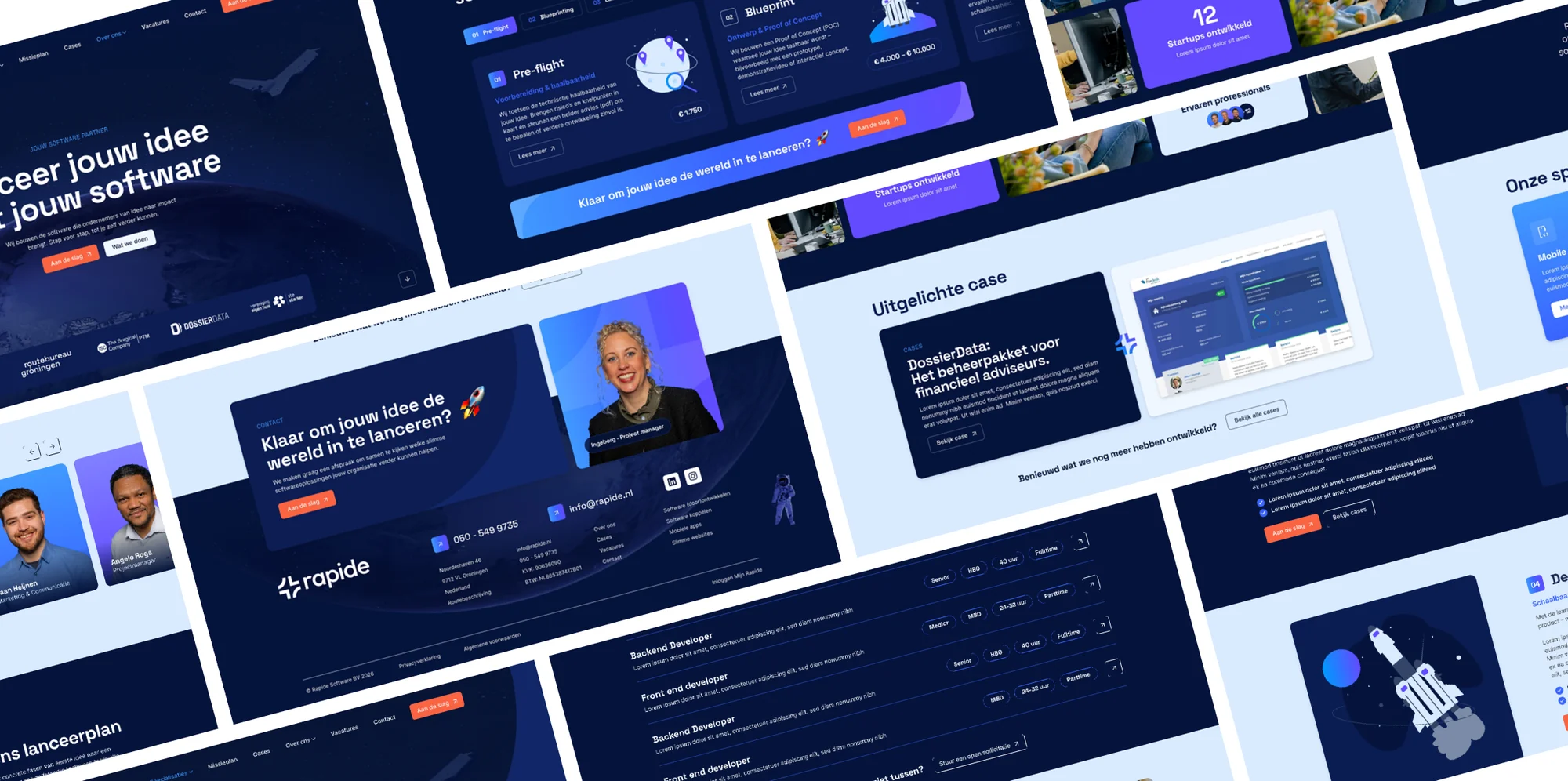
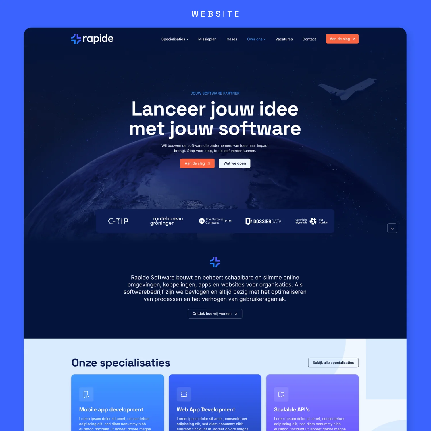
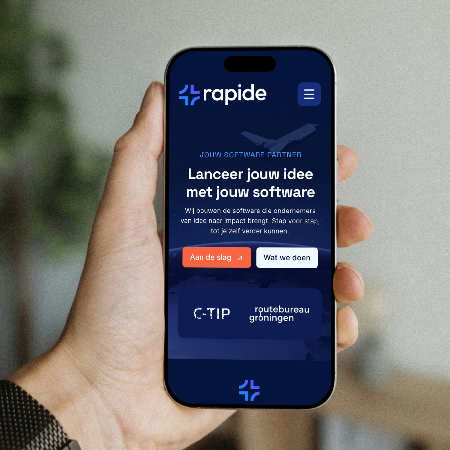
Everything together sits in the Brand Compass that Rapide received at the beginning of February 2026. After that came the design of the new website with a homepage and a team page and a featured case and the Launch Plan in five phases. Just as precise as the software Rapide stands for.